| Author | Thread |
Comments Made During the Challenge  |
|
|
01/28/2008 03:24:50 PM |
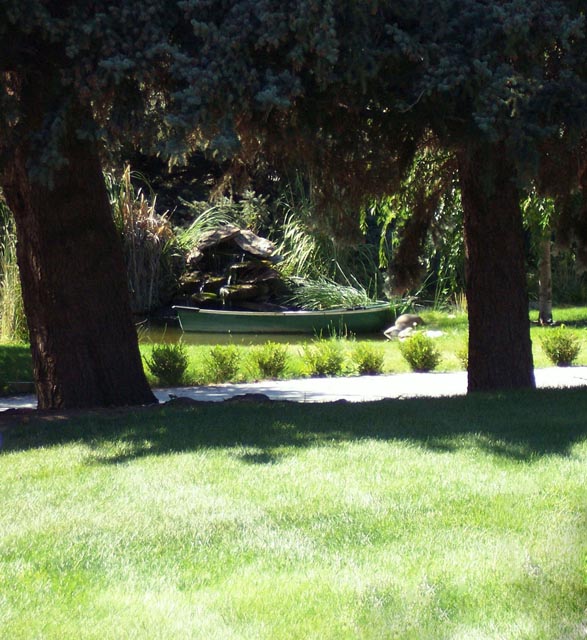
| Oh man. Why didn't you move in about 7 or 8 steps closer? You have a decent subject item here, but the foreground grass is really taking away from the overall impact of the presentation. Another option/choice would have been to use a split ND filter upside down to control the light on the grass (polarizer instead perhaps?). Lots of light reflecting off those grass blades. Just some observations. Good luck! |
|
|
|
01/28/2008 02:03:40 PM |
|
|
|
01/27/2008 01:38:28 AM |
| Comp does not really seem to work. I'd suggest cutting off a lot of the grass and a bit of the treetops. |
|
|
|
01/26/2008 11:08:56 AM |
| There's too much light and shadow here for me. The best lit part of the picture is the grass. |
|
|
|
01/25/2008 01:57:42 PM |
| I think you could have improved this by cropping of the bright grass in the foreground |
|
|
|
01/25/2008 12:35:19 PM |
|
|
|
01/23/2008 05:53:45 PM |
| i think this would have a better overall effect if it was cropped in a little more (my opinion)...but still a good shot. |
|
|
|
01/23/2008 10:11:58 AM |
| There's too much over exposed foreground. |
|
|
|
01/23/2008 07:46:15 AM |
| Nice place. I think that composition could have been improved. The grass in the foreground takes too much space in the image. |
|
|
|
01/23/2008 06:31:38 AM |
| I like the composition, but the foreground is very light. Think it would be nice is you cropped away the foreground and let the trees and the shadows frame your photo. |
|
Home -
Challenges -
Community -
League -
Photos -
Cameras -
Lenses -
Learn -
Help -
Terms of Use -
Privacy -
Top ^
DPChallenge, and website content and design, Copyright © 2001-2025 Challenging Technologies, LLC.
All digital photo copyrights belong to the photographers and may not be used without permission.
Current Server Time: 03/12/2025 03:35:01 AM EDT.