| Author | Thread |
Comments Made During the Challenge  |
|
|
01/29/2008 05:54:56 PM |
| Good idea, feel the composition isn't quite right though. |
|
 Photographer found comment helpful. Photographer found comment helpful. |
|
|
01/29/2008 03:08:48 PM |
| Just about every child seems to eat that. I like the set up of the photograph |
|
| Photographer found comment helpful. |
|
|
01/29/2008 02:27:02 PM |
| I think this would work better with fewer items. This is busy and my eye just wanders about the image. The focus needs to be sharper, and a levels adjustment would improve the white balance and contrast. |
|
| Photographer found comment helpful. |
|
|
01/28/2008 10:27:20 PM |
| The composition of this photo is good but it is hard to identify the focus of this photograph. |
|
| Photographer found comment helpful. |
|
|
01/28/2008 03:28:35 PM |
| cool idea - background of the wall isn't horrible, but just not very attractive; a better background would have made this a 7/8. - 6 |
|
| Photographer found comment helpful. |
|
|
01/28/2008 01:06:11 PM |
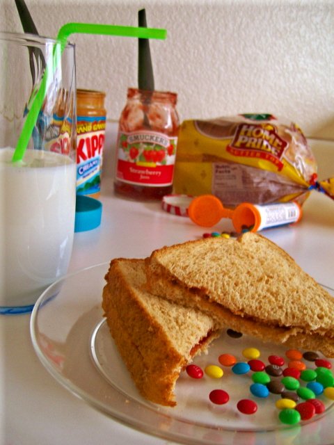
A peanut butter and M&M sammich. Yum!! Not sure if the composition totally works for me, but I like the concept and the use of the M&M's to add some punch.
I looked at your file size and I think part of the problem is too much JPEG compression is killing the details. Your file size is less than half what you could have used. Always used the lowest level of compression (resulting in the largest file) that will sneak in under the limit for a challenge. (150K in this case) |
|
| Photographer found comment helpful. |
|
|
01/27/2008 09:46:22 PM |
|
| Photographer found comment helpful. |
|
|
01/24/2008 04:39:40 PM |
| i like this idea.. i think that maybe it would have a better overall effect if there wasn't as many distractions in the background. |
|
| Photographer found comment helpful. |
|
|
01/24/2008 01:03:22 PM |
| No...No...I want mine on white bread! |
|
| Photographer found comment helpful. |
|
|
01/24/2008 11:29:57 AM |
| good take on the challenge |
|
| Photographer found comment helpful. |
|
|
01/24/2008 05:16:12 AM |
| Is the image tilted on purpose? I like the way things are arranged, but i feel reflections on the glass shd have been managed better |
|
| Photographer found comment helpful. |
|
|
01/24/2008 04:23:18 AM |
| This is not a healthy meal..... |
|
| Photographer found comment helpful. |
|
|
01/24/2008 01:36:56 AM |
| Nice idea...but it seemed a bit cluttered...maybe a tighter shot on the plate. The horizon didn't seem level either. |
|
| Photographer found comment helpful. |
|
|
01/23/2008 04:44:39 PM |
| Definitely shouts childhood! Lighting is nice and even. Objects lead my eye around the frame and back to the sandwich. Nicely done although not overly exciting or eye catching. |
|
| Photographer found comment helpful. |
|
|
01/23/2008 02:49:13 PM |
| not enough in focus for me |
|
| Photographer found comment helpful. |
|
|
01/23/2008 10:03:25 AM |
| I find the focus to be soft. |
|
| Photographer found comment helpful. |
|
|
01/23/2008 09:52:04 AM |
| It seems to be crooked to me... and could use more DOF. |
|
| Photographer found comment helpful. |
Home -
Challenges -
Community -
League -
Photos -
Cameras -
Lenses -
Learn -
Help -
Terms of Use -
Privacy -
Top ^
DPChallenge, and website content and design, Copyright © 2001-2025 Challenging Technologies, LLC.
All digital photo copyrights belong to the photographers and may not be used without permission.
Current Server Time: 03/12/2025 08:17:11 PM EDT.