| Author | Thread |
Comments Made During the Challenge  |
|
|
01/28/2008 09:25:12 PM |
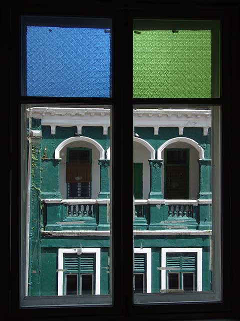
| too many lines and arches |
|
|
|
01/28/2008 03:33:15 PM |
| If possible I might have taken this from slightly further to the left so that the centre frame was in the middle of the centre arch to get some symmetry. Nice picture otherwise. |
|
|
|
01/28/2008 03:05:43 PM |
| very nice colors here. I like how you didn't use that middle bar to cut the other building exactly in half. 8. |
|
 Photographer found comment helpful. Photographer found comment helpful. |
|
|
01/25/2008 12:25:36 PM |
| I really like the colors, the crispness, great. |
|
| Photographer found comment helpful. |
|
|
01/23/2008 11:56:54 PM |
| Nice. The composition makes it look like a real window looking beyond the webpage. Goodluck.8. |
|
| Photographer found comment helpful. |
|
|
01/23/2008 07:11:36 AM |
|
|
|
01/23/2008 03:47:59 AM |
|
Home -
Challenges -
Community -
League -
Photos -
Cameras -
Lenses -
Learn -
Help -
Terms of Use -
Privacy -
Top ^
DPChallenge, and website content and design, Copyright © 2001-2025 Challenging Technologies, LLC.
All digital photo copyrights belong to the photographers and may not be used without permission.
Current Server Time: 04/26/2025 02:50:50 AM EDT.