| Author | Thread |
Comments Made During the Challenge  |
|
|
01/28/2008 08:37:54 PM |
|
|
|
01/28/2008 02:19:08 PM |
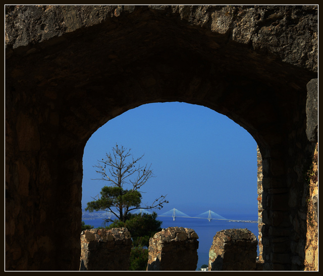
| Couldn't think of anything for a title? :-/ I like the photo overall. You picked a nice framing element for this challenge entry. I did notice, when scrolling down to comment, that the image takes on a different feel when the top is cropped off (losing the top brick part). Not sure if it's "better" or not that way, just an observation. Good luck in the challenge. |
|
|
|
01/27/2008 12:36:25 AM |
| nice scene but the photo seems a bit crooked. |
|
|
|
01/24/2008 06:31:29 AM |
| I think it would be better with a tighter crop. The framing element is very dark and takes too much space in the image. |
|
|
|
01/24/2008 01:15:09 AM |
| I love the use of framing as well as the obeject/area being framed! |
|
|
|
01/23/2008 07:20:01 PM |
| Like the clarity in the distant bridge, hard call on the amount of framing used, sometimes less is best...6 |
|
|
|
01/23/2008 05:15:27 PM |
| Contrast in colour and interesting. |
|
|
|
01/23/2008 04:47:35 PM |
| I think that the frame here takes up too much space |
|
|
|
01/23/2008 09:54:27 AM |
| confusion of subject. but i like the arch profile |
|
Home -
Challenges -
Community -
League -
Photos -
Cameras -
Lenses -
Learn -
Help -
Terms of Use -
Privacy -
Top ^
DPChallenge, and website content and design, Copyright © 2001-2025 Challenging Technologies, LLC.
All digital photo copyrights belong to the photographers and may not be used without permission.
Current Server Time: 04/02/2025 06:28:57 AM EDT.