| Author | Thread |
|
|
03/23/2004 12:52:21 PM |
From Critique club.
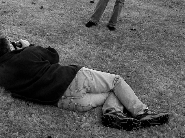
I disagree about the slanted horizon - look at the photographer - he is trying to make best of the model and some _unexpected_background_behind_the_model_!!! He sacrifices the orthonormallity and even himself - falling out of the frame!
The naked legs would trash the intrigue: "What did he see behind her? Why is it so important that even the color is irrelevant?"
I like this one a lot.
|
|
|
|
03/17/2004 08:17:54 AM |
| thanks a lot for all your helpful comments! |
|
Comments Made During the Challenge  |
|
|
03/16/2004 09:24:46 PM |
| Good picture. It might be just as nice in color. |
|
 Photographer found comment helpful. Photographer found comment helpful. |
|
|
03/12/2004 02:06:23 PM |
| might have gotten more points if those were naked legs to pull my attention out of the frame :) |
|
| Photographer found comment helpful. |
|
|
03/12/2004 10:06:59 AM |
| very clever...b/w works well |
|
| Photographer found comment helpful. |
|
|
03/11/2004 10:37:45 AM |
| I actually like the angle of the shot. Not sure about chopping off the photog's head? Would feet be better? |
|
| Photographer found comment helpful. |
|
|
03/10/2004 07:20:52 PM |
| meets the challenge but I wouldn't have cut the head off the photographer |
|
| Photographer found comment helpful. |
|
|
03/10/2004 01:32:17 PM |
| I like your concept, with a few "buts," of course. The "model" doesn't look like a model in the jeans. Plus he/she is either leaning, or your horizon is slanted. The bits of stuff in the grass near the model are distracting. I like where you placed the photographer and his position, but I would have either not cropped his head, or I would have cropped more off the right. Mainly, get that model looking like a model and standing straight! As he/she is right now, not terribly compelling... |
|
| Photographer found comment helpful. |
|
|
03/10/2004 07:22:28 AM |
| This photo draws me to the subject being 'shot at'. Quite effective |
|
| Photographer found comment helpful. |
|
|
03/10/2004 03:20:28 AM |
| I like the composition here. The photographer on the ground looks ok, and his subject is crooked. It makes for a neat composition. I like the contrast. I give it a 7. |
|
| Photographer found comment helpful. |
|
|
03/10/2004 12:48:02 AM |
| Nice choice of B/W. I also like your crop - I'm glad the model's legs are included, because it really enhances the "theme." Nice work. |
|
| Photographer found comment helpful. |
Home -
Challenges -
Community -
League -
Photos -
Cameras -
Lenses -
Learn -
Help -
Terms of Use -
Privacy -
Top ^
DPChallenge, and website content and design, Copyright © 2001-2025 Challenging Technologies, LLC.
All digital photo copyrights belong to the photographers and may not be used without permission.
Current Server Time: 03/12/2025 03:17:01 PM EDT.