| Author | Thread |
|
|
04/06/2008 05:50:28 PM |
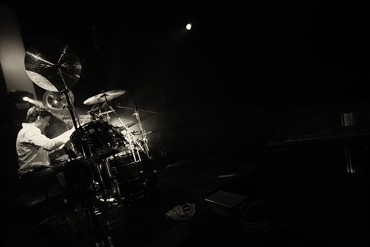
I love this shot - the tone is wonderful and the use of negative space really makes this shot tell a story. The lone musician in the spotlight...excellent.
edit to add, after reading some of the other comments, I have to say I really like the tilt in this shot as well would like to see the dot of light gone :)
Message edited by author 2008-04-06 17:52:07. |
|
 Photographer found comment helpful. Photographer found comment helpful. |
|
|
03/25/2008 09:46:08 PM |
| your choice of placement of light and subject is fantastic - just the right amount of negative space to tell the story |
|
| Photographer found comment helpful. |
|
|
02/26/2008 10:56:04 PM |
| Great composition and I like that the drummer is the only thing visible. |
|
| Photographer found comment helpful. |
|
|
02/15/2008 03:16:23 PM |
So its agreed? the light goes ;)
I like it and am thinking its practice night as there are no other peeps around. You have some great B&W shots in your portfolio and seem to know when to move from B&W to duotones. Much respect :) |
|
| Photographer found comment helpful. |
|
|
02/12/2008 06:55:29 PM |
| Sometimes photography is all about lack of light and the quality of darkness. In a friend's used bookstore in Brooklyn recently, he showed me a prized photography book ($200 out of print) in which the artist had taken many photos of the Arctic Sea - all of which were very close on being totally black. Just the merest small areas of sea or ice or... were lit. The paper the book was printed on was perfect for such images. They stayed in the mind, barely. I the viewer looked harder. I think I glimpsed something apart from the photos. Your photo reminds me of that enlightenment. The quality of the darkness is beautiful, as is its shape and the subject in the light. I was commenting on these bw images and came to yours about a week ago and it stopped me in my tracks. I know I appreciated it but I had to think on it a while.... now I can get on to the many other images submitted. I will have to pay you tuition in beer sometime, someplace ;-) |
|
| Photographer found comment helpful. |
|
|
02/12/2008 08:57:39 AM |
| I actually like the tilt in this shot, gives a a bit of dynamic to the shot and I think gives a feeling of loud sound coming from the drummer. I also like the negative space and the browner tone used. I might have clones out the lone light in the ceiling as it grabs a bit of attention. |
|
| Photographer found comment helpful. |
|
|
02/11/2008 10:45:27 AM |
| Like others have said, I'm not a fan of tilt. Probably because of my poor sense of equilibrium lol. I love how the lighting is only on the drummer but I almost feel like he's holding on to the drums because he is going to fall out of the frame. I do like the empty space because it makes you wonder who he is playing for. |
|
| Photographer found comment helpful. |
|
|
02/10/2008 12:26:28 AM |
| I like how you've used the high contrast to isolate you subject; it just seems like he's all alone there. There's just enough on the ride side to avoid it being totally empty space and makes me wonder where the rest of the band is at. I'd probably clone out that light above. |
|
| Photographer found comment helpful. |
|
|
02/08/2008 04:42:48 PM |
| This gives me the sense that he's playing alone for his own enjoyment - quite a good "portrait" of a musician who gets lost in the music. |
|
| Photographer found comment helpful. |
|
|
02/08/2008 12:29:25 PM |
| Very nice with all the negative space containing a hint of other things lurking. Love the tilt on this - though I'm normally not a fan of tilt. Good clarity, too. |
|
| Photographer found comment helpful. |
|
|
02/08/2008 10:29:08 AM |
| Interesting effect - the tilt and the negative space make it look like he's doing battle with some unknown force. An interesting twist on what could have been "just another band shot." |
|
| Photographer found comment helpful. |
|
|
02/06/2008 11:31:07 PM |
| awesome shot! i love live production! |
|
| Photographer found comment helpful. |
|
|
02/06/2008 11:20:46 PM |
| Really nice shot and the lighting is great. |
|
| Photographer found comment helpful. |
|
|
02/06/2008 10:09:40 AM |
Good isolation of subject, I dig negative space :)
|
|
| Photographer found comment helpful. |
|
|
02/06/2008 09:25:54 AM |
| I like the way the lighting isolates the subject, but there's just enough light to see the keyboard and other items. The tilt of the camera adds even more interest to the shot. |
|
| Photographer found comment helpful. |
|
|
02/06/2008 05:12:13 AM |
| cool image, the lighting really isolates the subject. |
|
| Photographer found comment helpful. |
|
|
02/06/2008 01:59:21 AM |
| Nice isolation of the subject, makes you feel like hes only playing for himself and not for anyone else. Good tones. I am also against the tilt |
|
| Photographer found comment helpful. |
|
|
02/05/2008 11:19:29 PM |
| I like the sharpness and detail mixed with motion. Nice shot. Not so sure about the tilt. LG |
|
| Photographer found comment helpful. |
|
|
02/05/2008 06:44:56 PM |
| Like the photo with its empty space, like the drummer and his stuff, lighting is good. Agree about cloning out bright light, trying to decide whether cropping a bit off right would be good, maybe also clone out one of the items on floor in middle (the one closest to the bottom). Not sure I understand the relationship of the title to the photo, but then again I was neither an art nor an english major in college. |
|
| Photographer found comment helpful. |
|
|
02/05/2008 05:30:03 PM |
| Cool lighting and the angle works. Nice conversion. The items on the right side of the photo draw your eyes away from the main subject to some extent. |
|
| Photographer found comment helpful. |
|
|
02/05/2008 12:14:17 PM |
| I think the burst of lights are used effectively.. and also like the use of negative space.. but not sure if I like the random pieces equipment.. maybe I would have prefered less detail in the dark. or maybe not.. not sure.. |
|
| Photographer found comment helpful. |
|
|
02/05/2008 11:54:58 AM |
| I like the empty space for some reason..really makes him stand out more. great lighting. I would clone out that light in the center though. |
|
| Photographer found comment helpful. |
Home -
Challenges -
Community -
League -
Photos -
Cameras -
Lenses -
Learn -
Help -
Terms of Use -
Privacy -
Top ^
DPChallenge, and website content and design, Copyright © 2001-2025 Challenging Technologies, LLC.
All digital photo copyrights belong to the photographers and may not be used without permission.
Current Server Time: 04/01/2025 09:24:08 PM EDT.