| Author | Thread |
|
|
04/01/2008 11:53:14 PM |
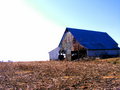
| yeah man, have to agree with the commenters below, def way over-saturated, as shown in the bright blues in the steps where there should not be any bright blues. with less color, or even black and white, i think this picture would have been a 6+, but did not deserve a 4.32. composition and framing is great, so is the light, processing just threw people off. And its a bit grainy, could use some neat image too! |
|
 Photographer found comment helpful. Photographer found comment helpful. |
Comments Made During the Challenge  |
|
|
02/05/2008 11:33:38 PM |
| Your "blues & cyans" color cast is plenty bright on the building and steps. The sky is a little grainy in the upper righthand corner too. I like the Architecture idea with the columns. -BB |
|
| Photographer found comment helpful. |
|
|
02/05/2008 11:18:29 PM |
| I'm not crazy about the processing, but the angle is nice. I trust YOU like the processing? |
|
| Photographer found comment helpful. |
|
|
02/05/2008 09:14:37 PM |
| Colors are toon blown out here |
|
| Photographer found comment helpful. |
|
|
02/05/2008 09:02:15 PM |
|
| Photographer found comment helpful. |
|
|
02/03/2008 12:45:54 PM |
| I think something went wrong with your processing. The blue cast is unnatural and there is a lot of noise in the photo. |
|
| Photographer found comment helpful. |
|
|
02/02/2008 07:22:24 PM |
| I think a little over-saturated |
|
| Photographer found comment helpful. |
|
|
02/02/2008 05:19:08 PM |
| The post processing detracts from the over all image. |
|
| Photographer found comment helpful. |
|
|
02/02/2008 06:19:25 AM |
| Easy on that sat button...bleed-through is very distracting. |
|
| Photographer found comment helpful. |
|
|
01/30/2008 10:31:14 PM |
| i like the title :) and the pic of course |
|
| Photographer found comment helpful. |
|
|
01/30/2008 03:13:34 PM |
|
| Photographer found comment helpful. |
|
|
01/30/2008 10:11:07 AM |
| the blue is much to powerful, IMO |
|
| Photographer found comment helpful. |
|
|
01/30/2008 09:54:39 AM |
|
| Photographer found comment helpful. |
|
|
01/30/2008 08:54:00 AM |
| You found the saturation slider! just too much. |
|
| Photographer found comment helpful. |
|
|
01/30/2008 12:43:58 AM |
| I like the subject and the composition. I like the repeated lines of the columns, and it seem to fit the challenge well. Perhaps it was your intention, but the saturation is very intense. Too intense for my taste. |
|
| Photographer found comment helpful. |
Home -
Challenges -
Community -
League -
Photos -
Cameras -
Lenses -
Learn -
Help -
Terms of Use -
Privacy -
Top ^
DPChallenge, and website content and design, Copyright © 2001-2025 Challenging Technologies, LLC.
All digital photo copyrights belong to the photographers and may not be used without permission.
Current Server Time: 03/14/2025 12:02:19 PM EDT.