| Author | Thread |
Comments Made During the Challenge  |
|
|
02/05/2008 02:17:21 PM |
|
|
|
02/05/2008 09:52:59 AM |
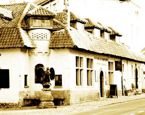
| It looks like an interesting building, well suited to be an interesting photo but the exposure was too bright. |
|
|
|
02/05/2008 09:52:55 AM |
| i don't like the composition much, and i think there is too much light which distracts from the overall image |
|
|
|
02/04/2008 08:53:32 PM |
|
|
|
02/04/2008 10:15:46 AM |
| This picture might have been better in Architecture. But none the less good photo. |
|
|
|
02/04/2008 07:23:24 AM |
| Too high contrast for me, but a great location for a shot! |
|
|
|
02/03/2008 05:28:47 PM |
| Wow. Nice, but very bright! |
|
|
|
02/03/2008 07:41:56 AM |
| too exposed for my liking... |
|
|
|
02/02/2008 08:29:03 PM |
| Nice idea, I like the sepia tone. It's a bit too washed out, though. |
|
|
|
02/02/2008 07:50:15 PM |
|
|
|
02/02/2008 05:00:21 PM |
| I just don't care for this style of lighting and color. It is a neat looking old building and I'd like to see more of the eagle. |
|
|
|
02/01/2008 07:18:02 PM |
|
|
|
02/01/2008 10:09:19 AM |
| it appears washed out or something. especially right behind that statue. the top right of the picture also appears that way so its hard to focus on any one spot. |
|
|
|
01/31/2008 10:16:28 PM |
| Looks to washed out to me. |
|
|
|
01/31/2008 05:12:25 PM |
| This is a good shot, but it is a little bright. |
|
|
|
01/31/2008 12:37:56 PM |
| Looks like the highlights are blown to me... the exposure should have been compensated for the strong light on the scene and the brightness of the building. |
|
|
|
01/31/2008 09:25:56 AM |
|
|
|
01/30/2008 07:58:54 PM |
| Seems a bit over exposed.... |
|
|
|
01/30/2008 07:39:51 PM |
| Great angle of the building, but the lighting is a little bright |
|
|
|
01/30/2008 06:14:22 PM |
|
|
|
01/30/2008 11:58:20 AM |
|
|
|
01/30/2008 11:14:55 AM |
| This could be better if it wasn't so blown out. |
|
|
|
01/30/2008 10:49:46 AM |
| Lots of detail is washed out. |
|
|
|
01/30/2008 09:21:57 AM |
| interesting exposure, it certainly grabs you and makes you feel as though it was taken years ago. |
|
|
|
01/30/2008 02:07:03 AM |
| too overexposed for my liking |
|
|
|
01/30/2008 01:06:32 AM |
| I like the way the photo looks altogether. Just like a picture you pulled outta Gram's picture basket!! (7) |
|
|
|
01/30/2008 12:52:21 AM |
| Needs more detail in highlight areas. |
|
Home -
Challenges -
Community -
League -
Photos -
Cameras -
Lenses -
Learn -
Help -
Terms of Use -
Privacy -
Top ^
DPChallenge, and website content and design, Copyright © 2001-2025 Challenging Technologies, LLC.
All digital photo copyrights belong to the photographers and may not be used without permission.
Current Server Time: 03/12/2025 06:15:08 PM EDT.