| Author | Thread |
|
|
02/14/2008 10:16:14 PM |
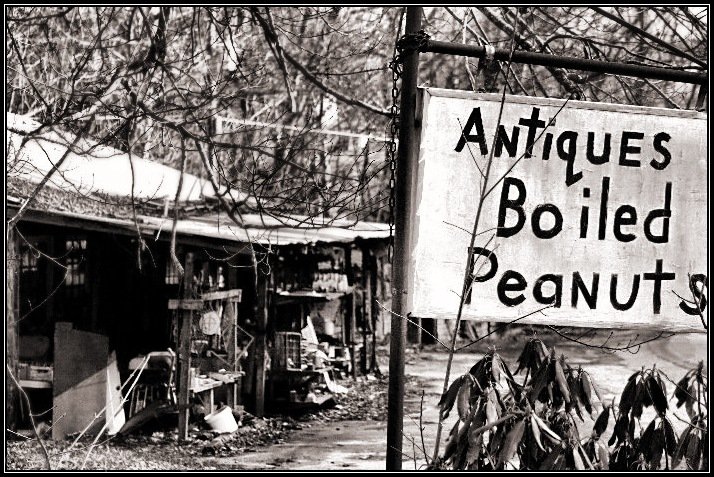
| i really like the sign and the junk in the background and b&w was a perfect choice. there's something i don't like, but, to be honest, i'm not sure what it is. i think it's the not quite in focus of the 'junk' and some of the branches while other branches look squiggly sharp. i think the composition is really good, though. |
|
 Photographer found comment helpful. Photographer found comment helpful. |
|
|
02/10/2008 12:59:31 AM |
| Heh! Reminds me of the signs like "Beer Ice Dancing" you see on little joints on the sides of back roads. I actually like the busy-ness of this - definitely adds to the cluttered and disorganized feel of the place. |
|
| Photographer found comment helpful. |
|
|
02/08/2008 08:32:05 PM |
| BW conversion was good and probably the strongest point of this. But I am sorry to say I do not find it interesting. And this is probably undoing of this photo. I really did not like the framing. Sorry for being negative but this is how I felt. |
|
| Photographer found comment helpful. |
|
|
02/08/2008 08:26:43 PM |
This photo has the perfect DOF to add to the "antique" background. I also like the processing and the tones. The one thing that is a little distracting to me are the tree branches over the building. They give a cluttered feel to the image.
But now that I have typed that, it seems that cluttered is sort of what this photo is all about. Maybe that is what you were going for and nailed it absolutely. |
|
| Photographer found comment helpful. |
|
|
02/08/2008 03:43:08 PM |
| I really need to see more focus/detail in the building/stuff/detritus. Overall, I like the brightness and for sure the quirkiness. |
|
| Photographer found comment helpful. |
|
|
02/08/2008 03:16:11 PM |
| A simple and direct shot, in all its odd juxtapositions. Yeah, the powerline is annoying, but at least it had the decency to slope at the same angle as the sign frame! :) |
|
| Photographer found comment helpful. |
|
|
02/08/2008 11:36:43 AM |
| yea. that blasted powerline bothered me too. i tried to get rid of it, and just couldn't get it to pass muster. . .. |
|
|
|
02/08/2008 11:32:36 AM |
High contrast, cold (rhododendrons tell me that), busy, interesting...all first impressions.
Love the title. I've seen several places like this along the Shenandoahs here in Virginia. Love to stop when I can as you never know what "treasures" you might find!
You know what pulls me away in this photo? The powerline in the bg. It's a thick white line that just jumps out no matter how much I try to avoid it.
What was your primary subject? The building, or the sign? I ask because your choice of aperture puts the sign squarely in focus, and teases with the building (not OOF for just bg, not sharp enough for comfortable viewing). Tough choice for sure. Go deeper and you bring in more "things" like branches, etc...go shallower and people will say they want more. Hmmm. Maybe you did make the correct aperture selection after all. :-D
Now you've made me want to take a road trip! He-he. |
|
| Photographer found comment helpful. |
|
|
02/08/2008 10:45:47 AM |
| I love lots about this one! The depth-of-field is great, the clarity is great, the B+W conversion is great, the framing is great... I think it's a photo that tells a story, and it makes me giggle :) |
|
| Photographer found comment helpful. |
|
|
02/08/2008 10:44:50 AM |
| I was also quite amused by this. I gave it a 7 in voting. The thought of boiled peanuts being sold with antiques is humerous in itself, but throw in that "building" and it just cracks me up. |
|
| Photographer found comment helpful. |
|
|
02/08/2008 03:52:43 AM |
| I really like this one. The composition is brilliant - our eyes are caught by the sign then led to the building behind it that's shrouded a little in mystery by the DoF. If I had one criticism it's that it's a wee bit oversharpened, particularly visible on the top of the sign and on the branches. Frankly, I'm surprised this didn't do better. |
|
| Photographer found comment helpful. |
|
|
02/08/2008 03:14:56 AM |
| If it would make you feel a bit better to know this, I gave it a 7. I thought it was an interesting choice and the B&W conversion is really nice. I thought it should definitely have scored higher. |
|
| Photographer found comment helpful. |
Comments Made During the Challenge  |
|
|
02/03/2008 08:56:05 PM |
| All those tree branches are very distracting to the overall composition of this photo. |
|
| Photographer found comment helpful. |
|
|
02/03/2008 06:27:59 PM |
| When I look at this image, I find the old building on the left more interesting, and it leaves me wanting to see more of it... I would have liked a photo of just that part better. |
|
| Photographer found comment helpful. |
|
|
02/02/2008 07:19:29 PM |
|
| Photographer found comment helpful. |
|
|
02/02/2008 06:22:40 PM |
| Now there is a combination. I like the high contrast B&W. |
|
| Photographer found comment helpful. |
Home -
Challenges -
Community -
League -
Photos -
Cameras -
Lenses -
Learn -
Help -
Terms of Use -
Privacy -
Top ^
DPChallenge, and website content and design, Copyright © 2001-2025 Challenging Technologies, LLC.
All digital photo copyrights belong to the photographers and may not be used without permission.
Current Server Time: 03/12/2025 03:16:22 AM EDT.