| Author | Thread |
|
|
02/14/2008 09:11:44 PM |
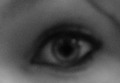
I see this fost-focusing technique as a way of peeling the meanings and interpretations from a photo to reach to the image. See, for example, in "archetype", all the information about the building is removed, and all I get to see is the shape and geometry, which is enough for a pleasant experience, it's a nice new way at looking at the interaction of the building with the space (although, in this particular case, the space is the sky).
Not here. In this case, this photo, I think, is a failure. I can't see anything interesting, pleasant, or engaging in the shape, colour, or even message, that will make this photo become an image. Too little thought and passion and imagination has gone into producing this thing, hence it offers too little.
I leave the door open, and go to look if I am suffering from hyperopia. |
|
 Photographer found comment helpful. Photographer found comment helpful. |
|
|
02/13/2008 06:46:35 PM |
|
| Photographer found comment helpful. |
Comments Made During the Challenge  |
|
|
02/12/2008 05:48:51 PM |
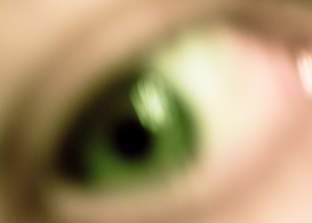
| Too blurred even for the title. |
|
| Photographer found comment helpful. |
|
|
02/11/2008 02:17:49 AM |
| makes me kind of nauseous.. |
|
| Photographer found comment helpful. |
|
|
02/10/2008 11:49:10 AM |
| The blur must be on purpose, but it doesn't do it for me. |
|
| Photographer found comment helpful. |
|
|
02/09/2008 06:51:47 PM |
| sorry, but this just doesn't work for me on any level |
|
| Photographer found comment helpful. |
|
|
02/09/2008 06:36:08 PM |
| The blurry shot doesnt do it for me. There is also a fair amount of noise. |
|
| Photographer found comment helpful. |
|
|
02/08/2008 09:21:12 AM |
| the green eye looks pretty cool but its too out of focus. |
|
| Photographer found comment helpful. |
|
|
02/07/2008 02:08:28 AM |
| Way too out of focus for me. |
|
| Photographer found comment helpful. |
|
|
02/06/2008 07:59:02 PM |
| Interesting, I see like that without my glasses or contacts, but i am shortsighted, so the whole world is a blur. 7 |
|
| Photographer found comment helpful. |
|
|
02/06/2008 03:00:54 PM |
| too blurred for my liking |
|
| Photographer found comment helpful. |
|
|
02/06/2008 01:28:28 PM |
Good on you for a different approach. We normally like to see eye's sharp. The title is naturally apt for the image and the OOF here is just at the right level. Colours are striking. Perhaps the only distraction for me is the highlights around the tear duct area.
Nice one and good luck. |
|
| Photographer found comment helpful. |
Home -
Challenges -
Community -
League -
Photos -
Cameras -
Lenses -
Learn -
Help -
Terms of Use -
Privacy -
Top ^
DPChallenge, and website content and design, Copyright © 2001-2025 Challenging Technologies, LLC.
All digital photo copyrights belong to the photographers and may not be used without permission.
Current Server Time: 03/12/2025 02:27:42 AM EDT.