| Author | Thread |
|
|
04/28/2008 12:18:05 AM |
| The expression of his face (especially the lines above his eyes)and the feel of the photo gives it a John Cusack over-all personality...generally serious with a rye wit and mischief around the edges. :} |
|
 Photographer found comment helpful. Photographer found comment helpful. |
|
|
03/01/2008 10:36:43 AM |
| Excellent. Wonderful light from behind the couch and works so, so well in black and white as you've converted it. Excellent image (I think this would have done well in a free study, it's such a great conversion and so well composed). |
|
| Photographer found comment helpful. |
|
|
02/14/2008 01:54:18 PM |
| Great job in making this a b/w image! Great tones and I like the cropping and composition - works well! |
|
| Photographer found comment helpful. |
|
|
02/11/2008 08:31:29 PM |
| This is a stunning portrait. I am guessing your friend is extremely happy with it. Beautiful tones. |
|
| Photographer found comment helpful. |
|
|
02/05/2008 09:26:08 PM |
|
| Photographer found comment helpful. |
|
|
02/05/2008 04:36:18 PM |
| I really like the expression. I like how i am drawn to this eyes without them being right on the rule of thirds. |
|
| Photographer found comment helpful. |
|
|
02/04/2008 02:04:49 AM |
Exactly what  Ecce Signum said. ('Cept the spelling). Ecce Signum said. ('Cept the spelling). |
|
| Photographer found comment helpful. |
|
|
02/03/2008 02:58:41 PM |
| you have captured a contemplative face - the side lighting works great to accentuate a really good face - like you said in your notes, you are unsure of the crop - i think there is a bit much neg space on the right, but the way it is right now actually makes me think and view longer - therefore, i think it works |
|
| Photographer found comment helpful. |
|
|
02/03/2008 08:34:28 AM |
| Great face. I like the light and the contrast. Perhaps you should have used portrait mode here. |
|
| Photographer found comment helpful. |
|
|
02/03/2008 12:51:59 AM |
| I love how your b/w conversion really helps emphasize the expression on his face. The whole photo has so much more drama now. And the lighting behind his head is a nice little extra effect. |
|
| Photographer found comment helpful. |
|
|
02/02/2008 01:25:20 PM |
| Good lighting and tones in the conversion. Great self portrait. Well done! |
|
| Photographer found comment helpful. |
|
|
02/02/2008 12:35:10 AM |
| I like how it almost seems as if you are in the spotlight. It is almost like you are being put on the spot, I think the negative space to the right of you adds to that. |
|
| Photographer found comment helpful. |
|
|
02/01/2008 11:41:52 PM |
| Nice lighting in this shot and I like the composition used. |
|
| Photographer found comment helpful. |
|
|
02/01/2008 05:19:54 PM |
| Nice job on the light; negative space works well here. |
|
| Photographer found comment helpful. |
|
|
01/31/2008 05:56:42 PM |
The b&w brigs the texture back to the face. Maybe to much ng space to my liking, still pretty good.
|
|
| Photographer found comment helpful. |
|
|
01/31/2008 03:09:53 PM |
Nice B&W portrait! I'm a sucker for negative space and often overdo it myself. Whilst I understand the comment below it might still work if you had more negative space, begging the question "should someone else be sitting there?
Good use of light, the light area behind his head works really well and just that niggling little shadow around his neck. Always good to add a touch of humour in the shot and love the raised eyebrow :)
*edited four speiling*
Message edited by author 2008-01-31 15:10:29. |
|
| Photographer found comment helpful. |
|
|
01/31/2008 01:05:27 PM |
| b/w makes this picture seem much more engaging then the coloured version .. the light helps with the composition now and seems more dynamic.. and you've caught a great expression :D |
|
| Photographer found comment helpful. |
|
|
01/31/2008 12:04:09 PM |
| I think the crop and the rotation work just fine. The B&W version has a much warmer feel to it to me than the color version does. |
|
| Photographer found comment helpful. |
|
|
01/31/2008 12:02:46 PM |
| I like your conversion. The lighting works out really well for that - the composition is good, too. The level issue isn't horrible - I wouldn't worry about it. |
|
| Photographer found comment helpful. |
|
|
01/31/2008 11:02:26 AM |
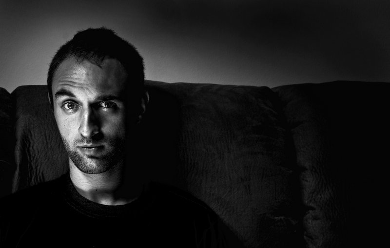
not me, my friend scott
thanks for the compliments and advice guys |
|
|
|
01/31/2008 10:54:55 AM |
| And..is this you? If so..nice to meet you! I really like the lighting and choice of composition here. Excellent tones for b/w. |
|
| Photographer found comment helpful. |
|
|
01/31/2008 08:38:04 AM |
I like the drama of portraits that have one side of the face darkened, and in this case the light on his right side is quite dramatic.
When you say you wish you had leveled it better, do you think it needs rotating? That's very easy to do in Photoshop. On your tool bar, there's a little crop tool, and when you drag to crop, if you put your cursor on one of the corners, you can rotate the photo before you click to crop and it will rotate it for you.
I like this alot, but I'm wondering if it were cropped closer to him on the right if it would look more professionally composed ??? To me there may be just a little too much negative space on the right of the picture. |
|
| Photographer found comment helpful. |
|
|
01/31/2008 07:57:28 AM |
| to his right was a light and he was holding a gold reflector in his lap |
|
|
|
01/31/2008 06:43:06 AM |
| Layers is what I consider here. The facial layer; the background layer. The distances apart, the depth of field, the techniques of taking such a photo. The loss of colour to accentuate the face. The asymmetry of the facial features parallel with the asymmetry of the composition. Use of gentle tones and softer lines is also something I note. |
|
| Photographer found comment helpful. |
|
|
01/31/2008 05:50:09 AM |
| Nice image - the portrait in B&W is really nice. What are you doing for lighting? |
|
| Photographer found comment helpful. |
Home -
Challenges -
Community -
League -
Photos -
Cameras -
Lenses -
Learn -
Help -
Terms of Use -
Privacy -
Top ^
DPChallenge, and website content and design, Copyright © 2001-2025 Challenging Technologies, LLC.
All digital photo copyrights belong to the photographers and may not be used without permission.
Current Server Time: 04/18/2025 01:11:49 AM EDT.