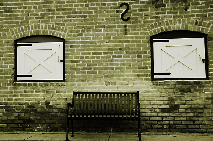
Nice tones and textures. I like that it's not perfectly symmetric -- that would have been the tempation (for me, at least). I might not have cropped the bottom of the bench so tight though.
i love the symmetry of this picture, the bench and the two doors are nice and comfortable, but that backwords S thing throws you off, i like it, it gives it a little bit of edgyness. as far as roatation, i wish it was straight on and level, you could fake that be rotating to line up with the brick, but then you would cut off the bottom of the bench which would be awkward. nice capture, smart chioce on the sepia.
Great eye on this one. Very nice choice of subject. I like the centered approach for the composition, there is good symmetry here, and the single black 's' at top offers nice opposition, and tension in the shot, a good 'break up' for the scene. However, it is just a little 'off', just enough to seem careless, and not fully thought out. I think in a shot like this, it can be greatly strengthened by really nailing the symmetry present, and emphasizing and driving home the centered comp. With all the lines that are here, going right to the edge of the frame, it is easy to see that it is not 'straight', or in line. Also, the distance from the edge of both sides of the frame, to the edge of the windows is not the same. I would say it looks like your shooting position could of been just a step or two to the left, and really squared it all up tight. I mean, this is just so close to that, it seems like that is the intent. This is just not 'off' enought to seem like it was the chosen POV. But if it was, then ignore me :-) Still a nice shot.
thanks all for the comments..
taterbug: you are right.. a bit lazy on my part and I found lateral misalignment is tricky to correct in PP :-)
Great eye on this one. Very nice choice of subject. I like the centered approach for the composition, there is good symmetry here, and the single black 's' at top offers nice opposition, and tension in the shot, a good 'break up' for the scene. However, it is just a little 'off', just enough to seem careless, and not fully thought out. I think in a shot like this, it can be greatly strengthened by really nailing the symmetry present, and emphasizing and driving home the centered comp. With all the lines that are here, going right to the edge of the frame, it is easy to see that it is not 'straight', or in line. Also, the distance from the edge of both sides of the frame, to the edge of the windows is not the same. I would say it looks like your shooting position could of been just a step or two to the left, and really squared it all up tight. I mean, this is just so close to that, it seems like that is the intent. This is just not 'off' enought to seem like it was the chosen POV. But if it was, then ignore me :-) Still a nice shot.