| Author | Thread |
Comments Made During the Challenge  |
|
|
02/11/2008 10:28:40 PM |
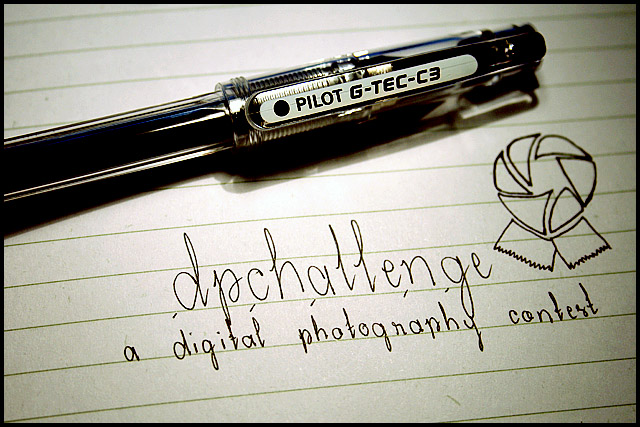
| I don't like this because while the lighting is good, as is the composition, the writing throws me off. I feel like it should be a company slogan, not a thing for the photo contest. but that's just me |
|
|
|
02/11/2008 03:13:14 AM |
|
 Photographer found comment helpful. Photographer found comment helpful. |
|
|
02/10/2008 06:50:12 PM |
| Nice idea and composition. The front of the pen is a little too dark, might look better with a soft front light to get rid of the deep shadows caused by the pen. |
|
| Photographer found comment helpful. |
|
|
02/09/2008 11:04:44 AM |
| Pretty effective ad, but is the name spelled wrong in the title? |
|
|
|
02/08/2008 11:03:52 AM |
| I guess I need one of these pens! If you can reduce the shadow under the pen it would be much better. |
|
| Photographer found comment helpful. |
|
|
02/08/2008 10:09:20 AM |
| i like how you made the picture personal to this contest. you're right. great handwriting |
|
| Photographer found comment helpful. |
|
|
02/07/2008 08:16:47 PM |
| Not bad. I'm sure what the product is and you've shown the comp lends itself well to text placement. LIghting seems a bit harsh and perhaps a light tent or fill flash could dispell the distracting shadows. |
|
|
|
02/07/2008 09:36:57 AM |
Nice DOF and focus. This is very well done, but a little bit cliche in my opinion.
5 |
|
| Photographer found comment helpful. |
|
|
02/06/2008 04:18:40 PM |
| clever. I like how simple it is. |
|
|
|
02/06/2008 08:34:39 AM |
| I feel that drawing a ribbon will count against you. |
|
Home -
Challenges -
Community -
League -
Photos -
Cameras -
Lenses -
Learn -
Help -
Terms of Use -
Privacy -
Top ^
DPChallenge, and website content and design, Copyright © 2001-2025 Challenging Technologies, LLC.
All digital photo copyrights belong to the photographers and may not be used without permission.
Current Server Time: 04/16/2025 05:21:57 AM EDT.