| Author | Thread |
|
|
08/19/2008 11:40:24 PM |
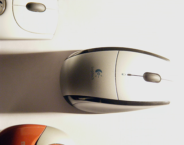
| My own preferred mouse. Doesn't have much range though, I have to make sure the receiver stays with about 2 feet. Feels right, though. I bought a second one to use at work, I liked this model so much. |
|
Comments Made During the Challenge  |
|
|
02/11/2008 10:16:49 PM |
| The color is a little washed out, and focusing so close on the mouse you sort of lose the idea that it's a race. Maybe a finish line and less bright lighting (maybe diffuse it?) would have made your message more readily apparent. |
|
 Photographer found comment helpful. Photographer found comment helpful. |
|
|
02/11/2008 05:59:24 PM |
| What a great concept. On my monitor, the whites seem a little blown out. Other than that, great shot! |
|
| Photographer found comment helpful. |
|
|
02/11/2008 10:30:29 AM |
| The right side of the photo is wahsed out. By using a darker color background and getting farther away from your subject you can eliminate that. |
|
| Photographer found comment helpful. |
|
|
02/11/2008 10:11:24 AM |
| there is too much light by the mouse in the center of the photo you could have blocked it to make the mouse more visible |
|
| Photographer found comment helpful. |
|
|
02/11/2008 09:58:40 AM |
| I like the concept for this photo, it definitely conveys the message. The light source also leads the eye to the main mouse. |
|
| Photographer found comment helpful. |
|
|
02/11/2008 02:41:39 AM |
|
| Photographer found comment helpful. |
|
|
02/10/2008 11:49:31 PM |
| Clever composition, but I feel like the lighting is a little too harsh. |
|
| Photographer found comment helpful. |
|
|
02/10/2008 08:12:57 PM |
| Nice concept. Would like it better with just a little more top light so the Logitech name is not in shadow. |
|
| Photographer found comment helpful. |
|
|
02/10/2008 05:01:14 PM |
| Nice way to use the lighting to give a motion effect. I don't know if I like the highlight effect but it seems like it was intentional. I'm sure what your selling and the comp is extraordinary. |
|
| Photographer found comment helpful. |
|
|
02/08/2008 06:58:07 PM |
|
| Photographer found comment helpful. |
|
|
02/07/2008 10:37:17 PM |
|
| Photographer found comment helpful. |
|
|
02/07/2008 10:30:28 AM |
| Good idea for the ad... but the logo should be better lit, IMHO, to make sure the buyer sees which one is the leader. |
|
| Photographer found comment helpful. |
|
|
02/06/2008 11:06:35 PM |
| This picture is creative, but the lighint is a bit harsh. |
|
| Photographer found comment helpful. |
|
|
02/06/2008 09:40:25 PM |
| The shadow is distracting, portions are burned out. This needs more definition. |
|
| Photographer found comment helpful. |
|
|
02/06/2008 03:13:36 PM |
|
| Photographer found comment helpful. |
|
|
02/06/2008 01:37:11 PM |
| A little too burnt for my liking but i can see where you were going with it. |
|
| Photographer found comment helpful. |
|
|
02/06/2008 09:27:16 AM |
|
| Photographer found comment helpful. |
|
|
02/06/2008 03:54:29 AM |
|
| Photographer found comment helpful. |
Home -
Challenges -
Community -
League -
Photos -
Cameras -
Lenses -
Learn -
Help -
Terms of Use -
Privacy -
Top ^
DPChallenge, and website content and design, Copyright © 2001-2025 Challenging Technologies, LLC.
All digital photo copyrights belong to the photographers and may not be used without permission.
Current Server Time: 03/12/2025 02:47:07 AM EDT.