| Author | Thread |
Comments Made During the Challenge  |
|
|
02/11/2008 11:04:03 PM |
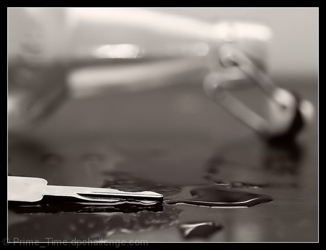
| While well shot this one took me a minute to figure out. The fact that it was a key wasn't readily apparent. |
|
 Photographer found comment helpful. Photographer found comment helpful. |
|
|
02/11/2008 11:10:47 AM |
| Needs more DOF to really get what this is trying to portray. I couldn't figure out what the background object was. |
|
| Photographer found comment helpful. |
|
|
02/11/2008 09:50:43 AM |
| Fantastic composition. The lighting creates a good contrast in this image. |
|
| Photographer found comment helpful. |
|
|
02/11/2008 02:57:10 AM |
|
| Photographer found comment helpful. |
|
|
02/10/2008 01:29:42 AM |
| The backgeound is too out-of-focus. It took too much effort to determine what it was. Good concept. |
|
| Photographer found comment helpful. |
|
|
02/08/2008 10:33:55 PM |
| I like the dof, its so cool. |
|
| Photographer found comment helpful. |
|
|
02/08/2008 06:53:06 PM |
| It took me a minute to understand this was a drink and drive ad. Good idea, but I think it needs to be move obvious at first glance. |
|
| Photographer found comment helpful. |
|
|
02/08/2008 10:00:02 AM |
| a promotion, but not really an ad. a cool picture, but not really in the theme. |
|
| Photographer found comment helpful. |
|
|
02/07/2008 09:07:49 PM |
| Good idea. Initial reaction was: What is this? Finally figured it out. The bottle in the background is too OOF, and the key in the foreground is blown out and at an angle that it is hard to recognize. The placement of the liquid doesn't have any continuity with the bottle, and seems to be just random puddles. Lighting is good except for the too hot key. Nice effect in B&W. The bottle should be OOF, just not quite so much. |
|
| Photographer found comment helpful. |
|
|
02/07/2008 09:29:44 AM |
| A really really good idea. Because the bottle is such a major aspect of the shot, I feel that it would work better with a deeper DOF. To be honest, I can't even tell what the object is in front of the bottle. |
|
| Photographer found comment helpful. |
|
|
02/07/2008 06:17:57 AM |
| Background too OOF to recognize quickly, message too obscure. |
|
| Photographer found comment helpful. |
|
|
02/06/2008 05:51:18 PM |
|
| Photographer found comment helpful. |
|
|
02/06/2008 04:58:38 PM |
| I won't! May not quite work on a drunk guy, but very cool idea none the less. |
|
| Photographer found comment helpful. |
|
|
02/06/2008 11:22:38 AM |
| Glad I took the time to see it, and I get it. I like the shot overall but find for an Ad the concept should be apparent immediately. The composition and focus point dont make the very OOF bottle apparent from first sight. |
|
| Photographer found comment helpful. |
|
|
02/06/2008 10:16:38 AM |
| I really had to look at this to get it. An ad should blast its message at me. Especially one as important as this. I think a deeper DOF would've had more impact. |
|
| Photographer found comment helpful. |
|
|
02/06/2008 09:48:49 AM |
| It took me about five min. to figure out what this was. The message was good and the picture would have been great if the bottle wasn't so blurry. Maybe you could back up and just crop it down to this size next time. |
|
Home -
Challenges -
Community -
League -
Photos -
Cameras -
Lenses -
Learn -
Help -
Terms of Use -
Privacy -
Top ^
DPChallenge, and website content and design, Copyright © 2001-2025 Challenging Technologies, LLC.
All digital photo copyrights belong to the photographers and may not be used without permission.
Current Server Time: 03/12/2025 02:50:42 AM EDT.