| Author | Thread |
|
|
06/05/2008 03:33:30 PM |
| to be honest the shot does nothing for me |
|
Comments Made During the Challenge  |
|
|
02/12/2008 07:27:57 PM |
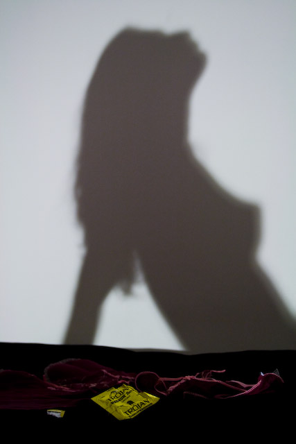
The shadow looks a little odd as if you were shooting at an extreme angle.
Also, at 38k,your file size is a lot smaller than was allowed. I think you have lost some clarity and detail to JPEG compression. Check the JPEG compression settings in your image editor and always try to save as close to the limit for a challenge as you can get it without going over. |
|
 Photographer found comment helpful. Photographer found comment helpful. |
|
|
02/12/2008 02:48:47 PM |
| lol great idea. how wude ;-) |
|
| Photographer found comment helpful. |
|
|
02/12/2008 10:50:31 AM |
| There's something odd about the sillouette... |
|
| Photographer found comment helpful. |
|
|
02/12/2008 10:34:20 AM |
|
| Photographer found comment helpful. |
|
|
02/11/2008 02:33:11 AM |
|
| Photographer found comment helpful. |
|
|
02/10/2008 08:03:04 PM |
| Nice concept. The bedspread/sheets are a little dark. |
|
| Photographer found comment helpful. |
|
|
02/10/2008 02:06:40 PM |
Good idea and good shadow.
The objects in the foreground could do with being better lit and slightly sharper focus so they lead the viewer into the picture a little more.
i wonder whether the picture might have been better with the model included in the picture but just out of focus ? At the moment you are apparently looking across the open packet and over the underware(?) to a wall - instead of to the lady.
Still a good effort though and a nice shape to the model : ) |
|
| Photographer found comment helpful. |
|
|
02/10/2008 10:47:17 AM |
| Shadow is fuzzy some. Color is dim in foreground. |
|
| Photographer found comment helpful. |
|
|
02/08/2008 06:52:00 PM |
| I really like the composition, but the shadow needs more clarity. (ven though it is a shadow) |
|
| Photographer found comment helpful. |
|
|
02/08/2008 09:52:06 AM |
| Clever. I couldn't help but laugh a little. WEll done |
|
| Photographer found comment helpful. |
|
|
02/07/2008 09:56:54 PM |
| Leroy?! Call me weird but I recognise that silhouette. Lovely shot and fantastic advert. The only downside is that there should be either more light on the product itself, but I can appreciate how hard that is to do with the silhouette AND basic editing. |
|
| Photographer found comment helpful. |
|
|
02/07/2008 09:12:27 PM |
|
| Photographer found comment helpful. |
|
|
02/07/2008 08:20:03 PM |
| heh heh heh.... great idea and I know from experience that it still sells. However the light seems a bit dark and the ad needs more of an emphasis on the product to sell it better. |
|
| Photographer found comment helpful. |
|
|
02/07/2008 04:04:23 PM |
|
| Photographer found comment helpful. |
|
|
02/07/2008 09:43:17 AM |
I think you're going to get a lot of similar comments on this photo. An excellent idea, with some great aspects.. But the subject (the wrapper) is so dark! What is the stuff around the wrapper? I can't even tell.
4 |
|
| Photographer found comment helpful. |
|
|
02/06/2008 10:01:05 PM |
|
| Photographer found comment helpful. |
|
|
02/06/2008 08:27:03 PM |
|
| Photographer found comment helpful. |
|
|
02/06/2008 04:34:09 PM |
| Actual subject, on the black is hard to see. 5. |
|
| Photographer found comment helpful. |
|
|
02/06/2008 04:25:59 PM |
|
| Photographer found comment helpful. |
|
|
02/06/2008 04:25:31 PM |
| Risquee! Interesting concept |
|
| Photographer found comment helpful. |
|
|
02/06/2008 10:02:38 AM |
| Can't really tell what the ad is for. The product is a little too small. |
|
| Photographer found comment helpful. |
|
|
02/06/2008 08:44:01 AM |
| I think this will be a bit coarse for some |
|
| Photographer found comment helpful. |
|
|
02/06/2008 03:56:51 AM |
The shadow is a bit warped.
Also, the bit of ripped packaging distracts me.
And the packaging isn't prominent enough.
Nice idea though. |
|
| Photographer found comment helpful. |
|
|
02/06/2008 03:54:40 AM |
| The torjan pack could be a bit more prominent in the pic... very good idea though! |
|
| Photographer found comment helpful. |
Home -
Challenges -
Community -
League -
Photos -
Cameras -
Lenses -
Learn -
Help -
Terms of Use -
Privacy -
Top ^
DPChallenge, and website content and design, Copyright © 2001-2025 Challenging Technologies, LLC.
All digital photo copyrights belong to the photographers and may not be used without permission.
Current Server Time: 03/10/2025 06:03:37 PM EDT.