| Author | Thread |
Comments Made During the Challenge  |
|
|
02/11/2008 03:02:45 AM |
| nice but not very eyecatching |
|
|
|
02/07/2008 09:56:56 PM |
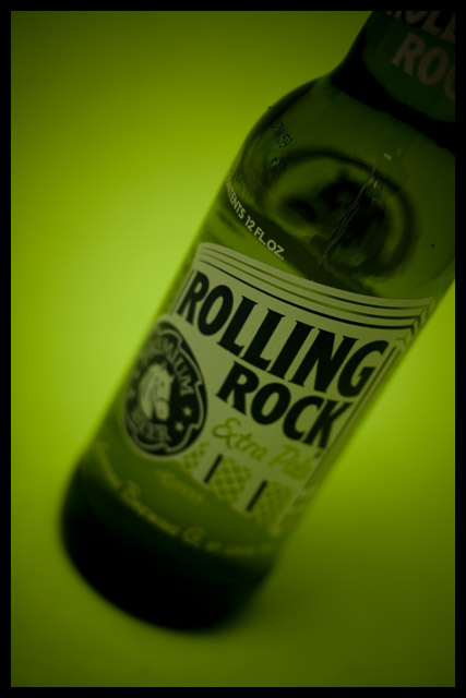
| I love this shot for the green tones especially...it just feels good to look at, and in my book that's a winner of an advert. The "message" - the name - is spot on and the DoF is lovely. Really a great way to make a beer bottle appeal and not a water spray or ice cube in sight...classy. |
|
|
|
02/07/2008 09:26:17 PM |
| The clarity of the label only really plays off the Advertisement theme. I like the green theme too. |
|
|
|
02/06/2008 10:09:23 PM |
| What is this floating in and why?? |
|
|
|
02/06/2008 07:36:07 PM |
| Nice lighting and comp. Text could be easily placed. Personally, I'd ask for a deeper DOF to highlight the product better. |
|
|
|
02/06/2008 06:28:33 PM |
Message edited by author 2008-03-03 18:41:00. |
|
|
|
02/06/2008 04:32:08 PM |
| Nice green color to accentuate the color of the bottle. Interesting angle. |
|
|
|
02/06/2008 03:06:26 PM |
| it would be better if the entire bottel was in focus |
|
|
|
02/06/2008 10:33:23 AM |
|
|
|
02/06/2008 09:24:38 AM |
| The green background is great. |
|
Home -
Challenges -
Community -
League -
Photos -
Cameras -
Lenses -
Learn -
Help -
Terms of Use -
Privacy -
Top ^
DPChallenge, and website content and design, Copyright © 2001-2025 Challenging Technologies, LLC.
All digital photo copyrights belong to the photographers and may not be used without permission.
Current Server Time: 03/12/2025 07:44:19 AM EDT.