| Author | Thread |
Comments Made During the Challenge  |
|
|
03/21/2004 09:40:03 PM |
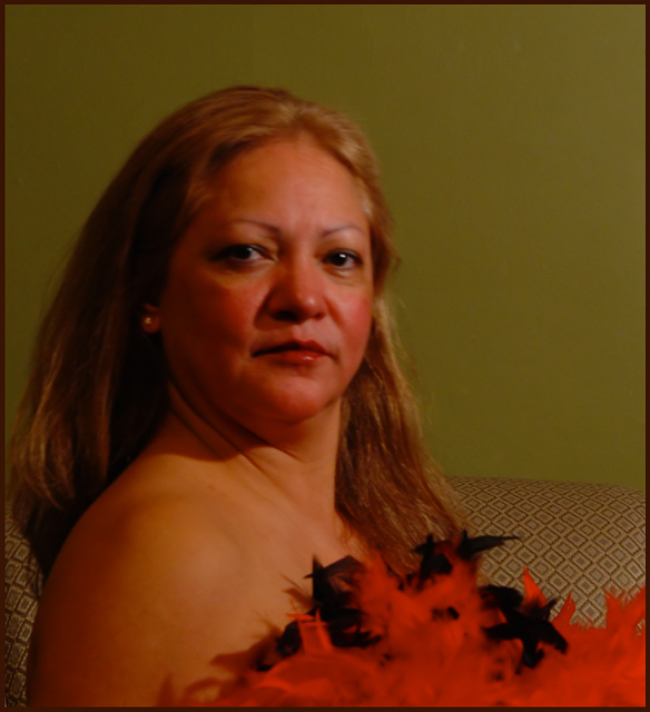
| Don't like the background color, or the fabric of what she's sitting on. The feather cover is a complete contrast to the surroundings and does clash. This shot also seems a bit out of focus. |
|
 Photographer found comment helpful. Photographer found comment helpful. |
|
|
03/21/2004 07:11:11 PM |
| I like her fierce, proud look. You did a great job capturing her attitude. I only gave this a 5 because I think the red in her complextion is too deep. The colors themselves do not blend well together and the design of the upholstery is very distracting. I think it would have been more interesting if you had cropped up to just below her shoulder and cloned out the sofa and corrected the wb. |
|
| Photographer found comment helpful. |
|
|
03/21/2004 07:10:51 PM |
| This could be better if the lightning and the focus was better, and the sofa in the background is a bit distracting too, good luck |
|
| Photographer found comment helpful. |
|
|
03/21/2004 01:53:23 PM |
| very unsharp in the face, focus seems to be on the couch behind her. Also needs white balance adjustment |
|
| Photographer found comment helpful. |
|
|
03/21/2004 01:37:14 AM |
| 2 - focus needs to be sharper. |
|
| Photographer found comment helpful. |
|
|
03/20/2004 07:56:21 AM |
| Lighting let this down badly which is a shame, a closer crop of the face maybe? |
|
| Photographer found comment helpful. |
|
|
03/19/2004 05:43:06 AM |
| the pose is a classic. the focus is off a bit, making the eyes look blurry. self portrait? hard to get in position quick enough, eh. I understand that |
|
| Photographer found comment helpful. |
|
|
03/18/2004 05:45:43 PM |
| out of focus and too dark |
|
| Photographer found comment helpful. |
|
|
03/17/2004 10:57:17 PM |
| the focus is a bit soft and the photo is very hazy...maybe experiment with some different lighting |
|
| Photographer found comment helpful. |
|
|
03/17/2004 08:33:28 PM |
| Looks a little blurry and the color is completely off. Did you try using PS to fix the colors? |
|
| Photographer found comment helpful. |
|
|
03/17/2004 04:51:14 PM |
| Great shot - color, attitude, focus, framing. - 8 |
|
| Photographer found comment helpful. |
|
|
03/17/2004 12:47:08 PM |
| Would love to see this with a solid back ground, your composition is perfect, perhaps it is my monitor, her face looks to red, keep up the good work. |
|
| Photographer found comment helpful. |
|
|
03/16/2004 09:45:34 PM |
| Horribly out of focus, lighting is very unflattering as is the background color. |
|
| Photographer found comment helpful. |
|
|
03/16/2004 04:19:38 PM |
| poor lighting, out of focus, needs work on color balance, hue and saturation, boring compostion |
|
| Photographer found comment helpful. |
|
|
03/16/2004 09:21:23 AM |
| focus appears a bit off to me. |
|
| Photographer found comment helpful. |
|
|
03/15/2004 06:44:03 PM |
|
| Photographer found comment helpful. |
|
|
03/15/2004 02:40:28 PM |
| Great capture. I love the expression and the face. My only suggestion would be to set your camera on a tripod to ensure a sharper focus. However, I love the colours and the composition. Good luck! |
|
| Photographer found comment helpful. |
|
|
03/15/2004 01:27:34 PM |
| The lighting needs to be improved and also it is slightly out of focus. |
|
| Photographer found comment helpful. |
|
|
03/15/2004 12:38:48 PM |
| Great shot. left side of the screen is somewhat out of focus. IMHO, I would have croppped out more of the rights side. BOL |
|
| Photographer found comment helpful. |
|
|
03/15/2004 10:23:03 AM |
| Confident looking lady. I think the feathers would of been great but the couch pattern needs to go. Little soft. |
|
| Photographer found comment helpful. |
|
|
03/15/2004 08:14:01 AM |
| Seems a bit out of focus (or moved) |
|
| Photographer found comment helpful. |
|
|
03/15/2004 07:31:44 AM |
| This is a great idea, with gentle soft focus. Cropping into the left shoulder and down to the top of the head might add emphasis to the subject, as would a lighter background. My compliments to your model. |
|
| Photographer found comment helpful. |
|
|
03/15/2004 06:37:22 AM |
| looks like you got a little motion blur or the focus is off... also, the wall behind her is very flat, especially where the light is dim behind her head, i would have tried throwing some light on the wall for a gradient or accent. |
|
| Photographer found comment helpful. |
|
|
03/15/2004 01:04:38 AM |
| The lighting in this shot seems very poor to me....very dim. The focus also seems off and the pose seems uncomfortable and unnatural for your model. |
|
| Photographer found comment helpful. |
Home -
Challenges -
Community -
League -
Photos -
Cameras -
Lenses -
Learn -
Help -
Terms of Use -
Privacy -
Top ^
DPChallenge, and website content and design, Copyright © 2001-2025 Challenging Technologies, LLC.
All digital photo copyrights belong to the photographers and may not be used without permission.
Current Server Time: 03/12/2025 03:06:15 AM EDT.