| Author | Thread |
|
|
02/26/2008 07:56:48 PM |
Greetings from the Critique Club
First Impression
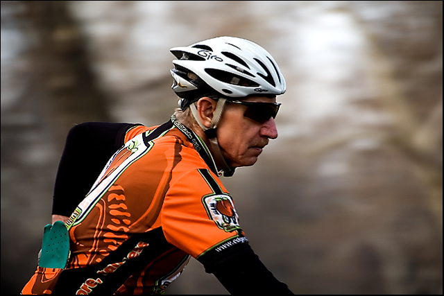
Bright with good details.
Looking Deeper
After having a minute to absorb this photo I find it to be done well overall. The details that jumped out at me when I first opened this are partially due to the bright colors I think. Add a very nice tonal range (white & blank points) with good contrast and my mind is sold.
The area around the rider's face (nose in particular) seem a bit oversharpened?
I think you did a nice job of capturing a true "panning" shot with this. Shutter speed and panning movement combined well to get the right amount of background blurring.
One thing that may have held this down some is that there isn't much room for the biker to move into - the composition is a bit tight IMO. A little more room to the right would have made this stronger.
Hmmm. I just read thru the comments you received during the challenge. Quite a few thought this shot didn't convey enough motion and that the results were accomplished with a shallow DOF.
Maybe 1/60 was too fast after all? :-) 1/30 would have showed more motion, but been trickier to keep the subject in focus.
Still, I'm a little surprised at the score. Had I seen this ahead of time I would have predicted 5.5xxx to 5.8xxx. But then again, I'm not the best at predicting. :-)
I thought you made a nice effort. There's always next time, eh?
Questions? If yes, feel free to send me a PM and let me know. Thanks! |
|
 Photographer found comment helpful. Photographer found comment helpful. |
Comments Made During the Challenge  |
|
|
02/19/2008 09:43:03 AM |
| Good picture the panning was done well good emphasis an the shirt |
|
| Photographer found comment helpful. |
|
|
02/19/2008 07:08:03 AM |
| strong image. the orange of his shirt contrasts the plain background |
|
| Photographer found comment helpful. |
|
|
02/19/2008 12:57:37 AM |
| From the appearance of this it doesn't look like anything more than shallow depth of field. |
|
| Photographer found comment helpful. |
|
|
02/15/2008 09:19:11 PM |
| not enough background "speed" but not a bad photo |
|
| Photographer found comment helpful. |
|
|
02/15/2008 11:00:08 AM |
| This gives me the impression of a static shot with very creamy bokeh. Disconnecting the rider from anything moving and without an obvious motion blur in the background, it gives my mind just a little difficulty reconciling the overall composition (and that might just be my feeble mind :) I like the angles & lines throughout. |
|
| Photographer found comment helpful. |
|
|
02/15/2008 04:35:22 AM |
| Nice focus, but the close crop makes it look like he's not moving. |
|
| Photographer found comment helpful. |
|
|
02/14/2008 01:55:04 PM |
| nice composition and colors. tough to see how the panning enhances the shot however. |
|
| Photographer found comment helpful. |
|
|
02/13/2008 08:14:44 PM |
|
| Photographer found comment helpful. |
|
|
02/13/2008 02:26:56 AM |
| Doesn't convey motion to me. My initial thought was that he is stopped and you took the photo with a shallow DOF. Like the colors, it's good photo, but not so much if you are trying to show panning. |
|
| Photographer found comment helpful. |
Home -
Challenges -
Community -
League -
Photos -
Cameras -
Lenses -
Learn -
Help -
Terms of Use -
Privacy -
Top ^
DPChallenge, and website content and design, Copyright © 2001-2025 Challenging Technologies, LLC.
All digital photo copyrights belong to the photographers and may not be used without permission.
Current Server Time: 04/26/2025 03:16:18 PM EDT.