| Author | Thread |
Comments Made During the Challenge  |
|
|
02/25/2008 06:07:34 PM |
great photo, great processing with the grain, not too sure about the leading lines but what the hay
7
Jack |
|
 Photographer found comment helpful. Photographer found comment helpful. |
|
|
02/25/2008 05:08:28 PM |
|
|
|
02/25/2008 12:41:12 AM |
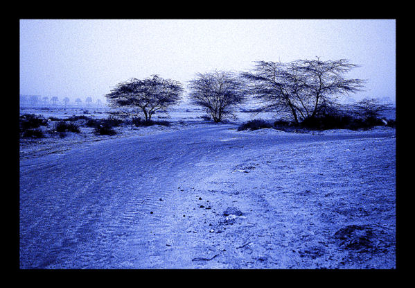
| I dont see very distinctive lines here. |
|
|
|
02/24/2008 08:42:52 AM |
| Interesting take on the challenge ... lines are very subtle |
|
| Photographer found comment helpful. |
|
|
02/23/2008 10:56:24 PM |
|
| Photographer found comment helpful. |
|
|
02/23/2008 02:11:24 PM |
| Not a fan of the color cast. The trees look out of focus |
|
|
|
02/23/2008 12:53:24 AM |
| I don't feel the lines are prominent enough, and the border is a little strong, and there is too much noise, but don't dispair! As an image in itself, it isn't bad, and I like the blues. |
|
| Photographer found comment helpful. |
|
|
02/22/2008 08:19:33 PM |
For some reason, this reminds me of the famous section in Robert Frost's poem:
Two roads diverged in a wood, and I--
I took the one less traveled by,
And that has made all the difference. |
|
| Photographer found comment helpful. |
|
|
02/22/2008 08:11:41 PM |
| I can't see the leading lines. Like the photo though. |
|
|
|
02/22/2008 01:38:10 PM |
| This one has potential but the blue cast and noise/grain are a bit of a distraction. |
|
| Photographer found comment helpful. |
|
|
02/22/2008 10:00:27 AM |
| framing is a tad overdone, IMO. I think, this could be much better, if there was less grain and other tones. The blue tones could be nice, but here it's a tad to powerful, IMO |
|
| Photographer found comment helpful. |
|
|
02/21/2008 03:55:12 PM |
|
| Photographer found comment helpful. |
|
|
02/21/2008 01:29:25 PM |
| The picture could do with being a little larger |
|
| Photographer found comment helpful. |
|
|
02/21/2008 10:38:44 AM |
| The border ruins it. You have a picture that gives a sense of a wide, open space hemmed in by an ugly frame. |
|
| Photographer found comment helpful. |
|
|
02/20/2008 03:57:49 PM |
| I really like the blue tones here. This big black frame is quite overbearing, though. |
|
| Photographer found comment helpful. |
Home -
Challenges -
Community -
League -
Photos -
Cameras -
Lenses -
Learn -
Help -
Terms of Use -
Privacy -
Top ^
DPChallenge, and website content and design, Copyright © 2001-2025 Challenging Technologies, LLC.
All digital photo copyrights belong to the photographers and may not be used without permission.
Current Server Time: 03/12/2025 02:30:32 AM EDT.