| Author | Thread |
Comments Made During the Challenge  |
|
|
03/23/2004 06:36:08 PM |
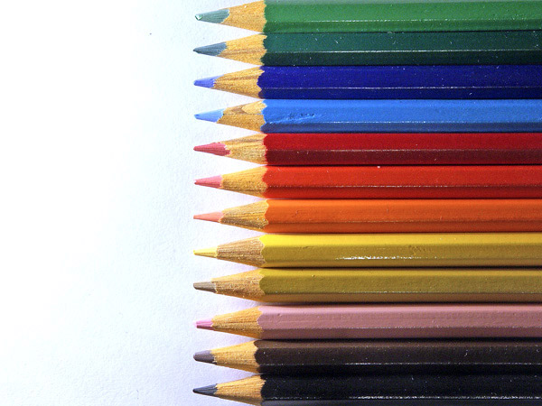
| I like the variety of colors, what I would have liked more is to see lines from the pencils going to the wrong colors across the white space. Still nice work 8 |
|
 Photographer found comment helpful. Photographer found comment helpful. |
|
|
03/23/2004 12:04:19 PM |
| A bit too much White Space on left half of the image |
|
| Photographer found comment helpful. |
|
|
03/23/2004 10:18:22 AM |
| fun colorful great entry. skillful lighting... |
|
| Photographer found comment helpful. |
|
|
03/22/2004 09:55:52 PM |
| IMO the lighting was a bit too harsh. Some softer light would have gotten you more points from me. |
|
| Photographer found comment helpful. |
|
|
03/21/2004 09:50:09 AM |
| Nice idea. I think this would have worked better with a bit less white space. |
|
| Photographer found comment helpful. |
|
|
03/19/2004 02:00:14 AM |
| Awesome use of negative space and color. I might have liked to have them more to the left or to the right (rule of thirds), but it works great as it is. |
|
| Photographer found comment helpful. |
|
|
03/18/2004 09:47:08 PM |
| Way to work in a lot of color. |
|
| Photographer found comment helpful. |
|
|
03/18/2004 12:38:57 PM |
| Think I'd have cropped a bit more from the left side and made this more vertical. |
|
| Photographer found comment helpful. |
|
|
03/18/2004 06:48:29 AM |
I bet your kicking yourself for that little black smudge near the top pencil :D
Great idea though. The lighting on the pencils could be increased slightly. |
|
| Photographer found comment helpful. |
|
|
03/17/2004 11:31:11 AM |
| In my opinion, there is too much white space. Filling the frame with the pencil points at the right edge would have been better. |
|
| Photographer found comment helpful. |
|
|
03/17/2004 12:21:48 AM |
| Very nice, colorful. Good focus and composition. 7 |
|
| Photographer found comment helpful. |