| Author | Thread |
Comments Made During the Challenge  |
|
|
03/03/2008 11:07:34 AM |
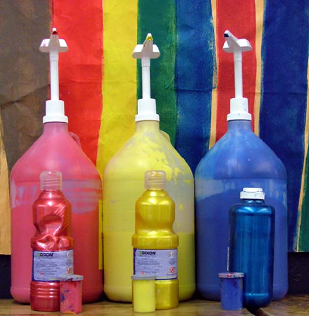
| A sharper focus, and maybe a tighter crop so that the stripes in the background weren't showing would make this more effective, I think. |
|
|
|
03/02/2008 09:32:07 PM |
Im not feeling this.
It's not in focus, Its not very interesting and the background doesnt fit the challenge.
tighter crop aroung the paint bottles would of worked. |
|
|
|
03/02/2008 06:00:37 PM |
| Nice set-up but a bit soft. |
|
|
|
03/02/2008 03:42:05 PM |
| I could do without the backdrop... or one that's just the three paint colors. |
|
|
|
03/01/2008 11:12:18 AM |
| Colors on colors. I could buy that. |
|
|
|
03/01/2008 02:19:46 AM |
| Little more sharpness and contrast would have createda huge difference .... |
|
|
|
02/29/2008 11:52:38 AM |
| I think the gap at the bottom of the background paper is a little distracting and would have been a lot more effective if it had come down all the way. |
|
|
|
02/29/2008 09:41:38 AM |
| very out of focus and not ver vibrant. |
|
|
|
02/28/2008 04:51:47 PM |
| clever to get three "color on color" in one shot. Seems a little out of focus though. Maybe, it's the processing???? |
|
|
|
02/27/2008 09:52:27 PM |
| wish it were more focused |
|
|
|
02/27/2008 09:53:26 AM |
| I feel this is slightly unsharp. Possibly due to jpegging? |
|
Home -
Challenges -
Community -
League -
Photos -
Cameras -
Lenses -
Learn -
Help -
Terms of Use -
Privacy -
Top ^
DPChallenge, and website content and design, Copyright © 2001-2025 Challenging Technologies, LLC.
All digital photo copyrights belong to the photographers and may not be used without permission.
Current Server Time: 04/28/2025 07:01:28 AM EDT.