| Author | Thread |
Comments Made During the Challenge  |
|
|
03/08/2008 09:03:20 PM |
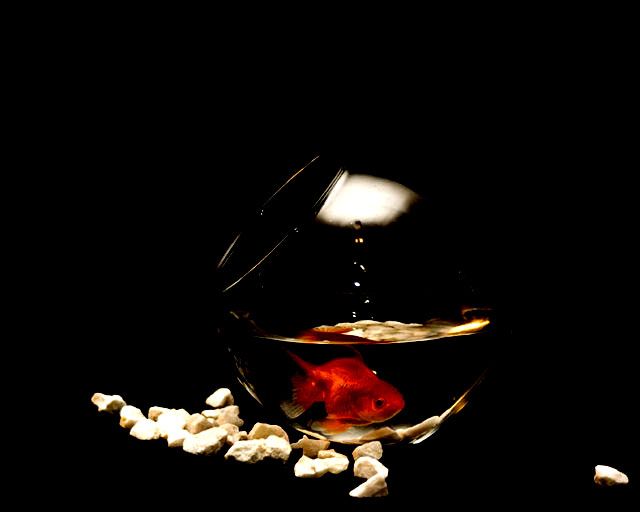
| I like the concept, lighting seems to be off a little though - a little brighter from the right and a little less from the left (blown out on the stones)and I think this may have worked better. 7 |
|
 Photographer found comment helpful. Photographer found comment helpful. |
|
|
03/08/2008 12:16:02 PM |
| I love this. This is cute! I also admire the way you kind of highlighted the white rocks. :O Is the fishie upside down? My fish always did that. And then he died. :( Great photo. Well done. |
|
| Photographer found comment helpful. |
|
|
03/08/2008 12:21:37 AM |
| The rocks below the the bowl create contrast and bring emphasis to the richly colored fish. |
|
| Photographer found comment helpful. |
|
|
03/07/2008 11:38:29 AM |
| Nice image. Looks like you have slightly blownout some of the stones. |
|
| Photographer found comment helpful. |
|
|
03/07/2008 09:36:43 AM |
| I like how you used the dark back round to really make your focal point stand out. |
|
| Photographer found comment helpful. |
|
|
03/06/2008 10:00:05 AM |
|
| Photographer found comment helpful. |
|
|
03/06/2008 08:37:22 AM |
| Nice idea but a few technical issues. Very dark image and pretty much all of the few highlights are blown out which is a shame. |
|
| Photographer found comment helpful. |
|
|
03/06/2008 02:19:52 AM |
| I think this is a very good idea, but the bright parts are too bright and therefore lacking in detail. If the stones were more subdued the fish would stand out better. |
|
| Photographer found comment helpful. |
Home -
Challenges -
Community -
League -
Photos -
Cameras -
Lenses -
Learn -
Help -
Terms of Use -
Privacy -
Top ^
DPChallenge, and website content and design, Copyright © 2001-2025 Challenging Technologies, LLC.
All digital photo copyrights belong to the photographers and may not be used without permission.
Current Server Time: 04/11/2025 10:08:29 AM EDT.