| Author | Thread |
Comments Made During the Challenge  |
|
|
03/30/2004 09:10:41 PM |
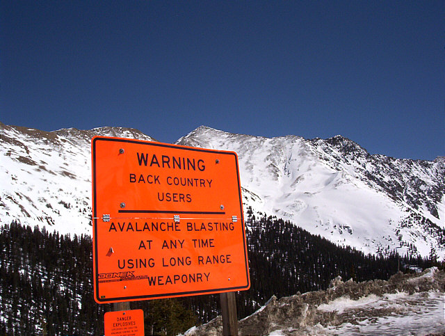
| Good color. Composition might be improved with the sign further off to the left and a lower POV so the sign breaks the plane of the mountains. |
|
|
|
03/30/2004 12:04:49 PM |
| The title does too much work...let the photo speak. |
|
|
|
03/29/2004 07:25:28 AM |
|
|
|
03/27/2004 12:32:19 PM |
|
|
|
03/26/2004 04:49:03 PM |
| Their loss is your gain. It has made a good picture. |
|
|
|
03/26/2004 09:07:13 AM |
| I think you should have got all of the lower sign in the picture, and this would also have pushed the skyline up towards the top third-line. |
|
|
|
03/25/2004 04:42:55 PM |
| hehe I like the juxtaposition of elements, textures and colours |
|
|
|
03/25/2004 03:08:25 PM |
| While the sign may be ugly, I am sure the message is quite important. Well, good think avalanche blasting wasn't popular back in Ansel's days. |
|
|
|
03/25/2004 12:22:58 PM |
| Great shot of this sign against this beautiful background. Perhaps tilting down the camera would have helped a bit. |
|
|
|
03/25/2004 05:23:40 AM |
| wow! could a shot be any clearer than this?! i don't think so, but... is this enough for this challenge... |
|
|
|
03/24/2004 09:02:43 PM |
|
|
|
03/24/2004 04:54:18 AM |
| Yep, see these all the time. Never thought to take a picture of one. Great idea!! |
|
|
|
03/24/2004 03:27:56 AM |
| recrop with the sign more left and perhaps lower, not so 'in your face' |
|
Home -
Challenges -
Community -
League -
Photos -
Cameras -
Lenses -
Learn -
Help -
Terms of Use -
Privacy -
Top ^
DPChallenge, and website content and design, Copyright © 2001-2025 Challenging Technologies, LLC.
All digital photo copyrights belong to the photographers and may not be used without permission.
Current Server Time: 03/12/2025 01:24:52 AM EDT.