| Author | Thread |
|
|
10/26/2008 07:31:58 AM |
| Popped this one open cause in thumbnail it looked darn scary. Good take on the challenge. |
|
 Photographer found comment helpful. Photographer found comment helpful. |
Comments Made During the Challenge  |
|
|
03/11/2008 07:12:53 PM |
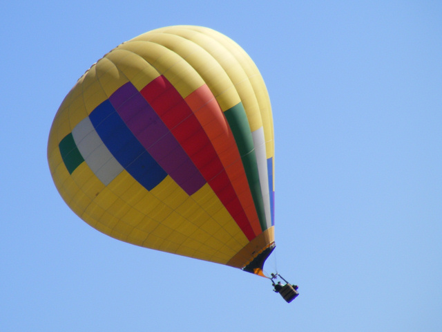
| lol nice idea. The balloon isn't really in focus though. |
|
| Photographer found comment helpful. |
|
|
03/11/2008 11:34:57 AM |
|
| Photographer found comment helpful. |
|
|
03/10/2008 08:16:19 PM |
| Wow, that looks like a freaky balloon ride! Colors are nice, but I think could be a bit more saturatd. Also, maybe some more clouds, or gross looking weather. Looks to nice and peaceful out to be giving people such a bad ride! |
|
| Photographer found comment helpful. |
|
|
03/09/2008 11:19:44 PM |
There are a number of ways to push up the color, to really make this pop.
It is a little on the flat side. There is some fringing on the bottom of the basket. |
|
| Photographer found comment helpful. |
|
|
03/09/2008 07:19:30 PM |
| Wow... a slight tilt really changes the "story" that I'd put to this shot. It helps that the people in the basket are both to the same side, looking like they're trying to stay balanced in the balloon as it is whisked away in the wind. |
|
| Photographer found comment helpful. |
|
|
03/09/2008 05:07:19 PM |
| Perhaps not as sharp as I would have liked it to be. I'm guessing it was a fairly heavy crop? Great idea and it works well, made me laugh. Good title. |
|
| Photographer found comment helpful. |
|
|
03/09/2008 04:08:29 PM |
| I like this image. This was a good subject for the shoot. The rythm that you capture is good. |
|
| Photographer found comment helpful. |
|
|
03/08/2008 05:59:15 PM |
| Yes tilt works very much here. Exactly fits the challenge. Without the tilt this would have not fit your title. Good work. |
|
| Photographer found comment helpful. |
|
|
03/08/2008 01:01:14 PM |
| You should be able to push the colour saturation a lot harder on an image like this. The basket is a little soft which is a shame. Nice and clean though which is good |
|
| Photographer found comment helpful. |
|
|
03/08/2008 12:26:38 PM |
| I like this. It could be so much better if it was a bit clearer and sharper and the colours were more standing out. I like this, but it could look better in my opinion. |
|
| Photographer found comment helpful. |
|
|
03/07/2008 10:01:41 PM |
| Very clever. A little more contrast maybe... |
|
| Photographer found comment helpful. |
|
|
03/07/2008 06:20:31 PM |
| right side of frame is emppy - maybe centering would help. love the tilt - 7 |
|
| Photographer found comment helpful. |
|
|
03/07/2008 01:44:13 PM |
|
| Photographer found comment helpful. |
|
|
03/07/2008 10:09:43 AM |
| It looks like the people are going to fall out |
|
| Photographer found comment helpful. |
|
|
03/05/2008 09:14:57 PM |
| The colors are very flat in this photo |
|
| Photographer found comment helpful. |
|
|
03/05/2008 01:09:49 AM |
| I like the title, it made me smile. |
|
| Photographer found comment helpful. |
Home -
Challenges -
Community -
League -
Photos -
Cameras -
Lenses -
Learn -
Help -
Terms of Use -
Privacy -
Top ^
DPChallenge, and website content and design, Copyright © 2001-2025 Challenging Technologies, LLC.
All digital photo copyrights belong to the photographers and may not be used without permission.
Current Server Time: 03/18/2025 04:47:31 AM EDT.