| Author | Thread |
|
|
03/05/2008 04:56:58 PM |
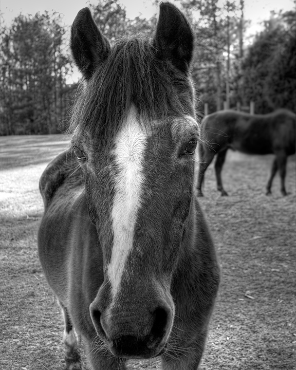
To me the black and white conversion seems to work well. However I really don't like how the back of the other horse seems to come straight out of the horses left eye. Maybe next time, overall though I like the composition. (oops I accidently commented on  aliqui's take on this photo, here is the comment for you.) lol aliqui's take on this photo, here is the comment for you.) lol |
|
 Photographer found comment helpful. Photographer found comment helpful. |
|
|
03/05/2008 04:36:23 PM |
When I look at the photo the horses head begs to come out of the photo. It's clearly the main focus and why you chose a close-up shot to begin with. As you and others have mentioned, there's a headless horse in the background, so obviously your framing wasn't ideal. Blurring the background probably did help to deemphasize the distracting background.
I threw your photo in Photoshop to see what I would do to the photo if it were mine. The very first thing I did was add a vignette (I'm on a vignette kick lately). I did it the quick and dirty way by just burning the corners. Next I whipped out the dodge tool. I focused on the head, since that's what needs to stand out. I brightened the stripe down her nose and touched on the sunlight on her eyelids and nostrils. It still seemed a little dark, so I did a couple more passovers of the whole head with the dodge tool. I burnt the eyes to make them blacker and make them stand out.
 |
|
| Photographer found comment helpful. |
|
|
03/05/2008 01:30:11 PM |
| Depending what you are using this image for, if you were wanting to eliminate the other horse, perhaps a tighter crop and cloning out the other horse? The eyes are quite sharp, which is good. Of course if she were looking up a little more, be better, but difficult. Could just be perspective, but this looks like it needs a whisker up on the left to straighten. The nose is a little dark and has lost detail but that could be a result of the b&w conversion, which is nice - but again, depends what you want to do with the image. It's difficult to crop to the head when you can still see some of the legs 'chopped'. Could just be the angle, but seeing her hip(s), she looks like she may not be in the best shape. Looks like a sweet natured horse. If you get another go, perhaps a carrot or apple would help you with 'movement'. |
|
| Photographer found comment helpful. |
|
|
03/05/2008 12:44:00 PM |
Next time, bring some carrots or apple slices. That'll get 'em to move! :-)
I'm not sure how honest you want this opinion to be???
You did capture some great detail in the face. Very sharp, and the exposure was handled nicely as well. Love how the eyes are nice and sharp. Tonal range of the B/W is fine.
Compositionally, it's cramped and cluttered IMO, and a bit centered. More space above and below the horses' head would help. The horse in the background is a distraction...if you can't move the main subject, then I'd have included the entire bg horse and not cut off the head.
Looking at the lens you used, you may have been better served to go with F3.5 instead of 5.6 if possible to lose more of the bg. You may have been extended out to the end of the zoom range and an aperture change wasn't an option?
I'm lousy at dodge/burn myself so I can't provide any tips, but the upper-left burn is a little too obvious I think.
All JMO of course. :-) |
|
| Photographer found comment helpful. |
|
|
03/05/2008 12:37:46 PM |
I noticed the headless horse in the background then read your comment so know you're aware of that already. ;o)
I think this would do much better with shallower DOF. Shooting wide open at 3.5 probably would have helped a bit.
I also think the image needs more contrast. |
|
| Photographer found comment helpful. |
Home -
Challenges -
Community -
League -
Photos -
Cameras -
Lenses -
Learn -
Help -
Terms of Use -
Privacy -
Top ^
DPChallenge, and website content and design, Copyright © 2001-2025 Challenging Technologies, LLC.
All digital photo copyrights belong to the photographers and may not be used without permission.
Current Server Time: 04/22/2025 12:50:53 PM EDT.