| Author | Thread |
Comments Made During the Challenge  |
|
|
03/11/2008 03:30:50 AM |
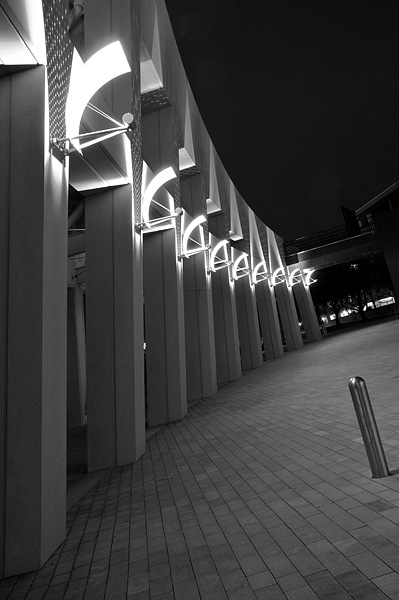
| Love it, the lighting effect is nice. The silver pole is a bit distracting, however. |
|
 Photographer found comment helpful. Photographer found comment helpful. |
|
|
03/10/2008 08:15:13 PM |
| I think that the location of the metal pole on the right is a bit distracting. I think that hugging the beams, and using more telephoto to compact them together would have helped this shot a lot |
|
| Photographer found comment helpful. |
|
|
03/10/2008 01:37:40 PM |
| Makes me feel like I've had just a couple too many. (That was a compliment on the effective use of the tilt, BTW.) |
|
| Photographer found comment helpful. |
|
|
03/10/2008 09:29:28 AM |
| Nice angle and composition |
|
| Photographer found comment helpful. |
|
|
03/09/2008 06:56:59 PM |
| I like how the columns are at a variety of angles throughout the frame.. leaning slightly inward to bending outward at the far end of the shot. Interesting tilts all throughout the picture, and I also like how the lights create a nice soft curve. I could do without that pole on the right, but sometimes you just have to deal with whatever is there! |
|
| Photographer found comment helpful. |
|
|
03/09/2008 07:25:05 AM |
| Beautifully lit, nice Tilt, sharpness and spatiality - the "pole" is a bit of a distraction, until you see how congruent it is with the rest of the angles captured here - very nice!!! |
|
| Photographer found comment helpful. |
|
|
03/08/2008 10:49:21 AM |
| The small pole is very distracting, thats the first thing my eye went to. If this was gone. The lights would have led you to the tilted opening at the back of the photo. |
|
| Photographer found comment helpful. |
|
|
03/08/2008 07:27:45 AM |
|
| Photographer found comment helpful. |
|
|
03/08/2008 12:21:41 AM |
| This photograph is a good example of tilting without being to obvious. There contrast of the lights is very nice. |
|
| Photographer found comment helpful. |
|
|
03/07/2008 10:05:04 PM |
|
| Photographer found comment helpful. |
|
|
03/07/2008 12:28:48 PM |
| Really like the tonality here. Well done. |
|
| Photographer found comment helpful. |
|
|
03/07/2008 09:33:40 AM |
| The tilted effect really makes this picture look like an optical allusion. Great shot i like it. Maybe try making it colored |
|
| Photographer found comment helpful. |
|
|
03/07/2008 09:01:48 AM |
| Nice cropping but when you do a black and white photo i always think that you should add more contrast because grey is so boring (just a personal opinion)and the lights ae so bright compared to the grey it is a little distracting. I really like the picture though.. |
|
| Photographer found comment helpful. |
|
|
03/05/2008 01:50:32 PM |
| Good horizon, adds a great effect. |
|
| Photographer found comment helpful. |
|
|
03/05/2008 11:43:41 AM |
| I think the metal pole on the right distracts form the rest of the picture. |
|
| Photographer found comment helpful. |
Home -
Challenges -
Community -
League -
Photos -
Cameras -
Lenses -
Learn -
Help -
Terms of Use -
Privacy -
Top ^
DPChallenge, and website content and design, Copyright © 2001-2025 Challenging Technologies, LLC.
All digital photo copyrights belong to the photographers and may not be used without permission.
Current Server Time: 03/12/2025 01:56:39 AM EDT.