| Author | Thread |
|
|
04/16/2004 03:57:49 PM |
Like the "poster" effect you got here..fits the image really well.
I tried a similar technique for the "portrait" challenge..only taking it a stage further..(I go back to the sixties..Hard day`s night front cover, etc) :)
Unfortunately, not many voters appreciate this kind of work...ah well it`s their loss.
Gordon |
|
 Photographer found comment helpful. Photographer found comment helpful. |
Comments Made During the Challenge  |
|
|
04/04/2004 09:36:50 PM |
| Nice and original effect. -9 |
|
| Photographer found comment helpful. |
|
|
04/04/2004 10:43:12 AM |
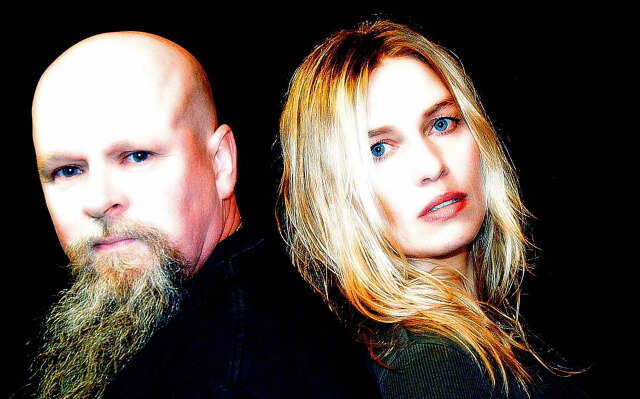
| Cool portrait with wonderful eyes, color, expressions. I am not sure what the title means, unless it's a joke; maybe you'll explain afterward! |
|
| Photographer found comment helpful. |
|
|
04/03/2004 09:09:05 PM |
| Expressions, title, pose, crop, and color choice are all great. The only suggestion I have is that this looks slightly overexposed to me which keeps it from being a fantastic entry. -8 |
|
| Photographer found comment helpful. |
|
|
04/03/2004 08:31:15 PM |
| Do they know each other..excellent image |
|
| Photographer found comment helpful. |
|
|
04/03/2004 08:15:48 PM |
| way over saturated. the eyes of the left person could have been cloned on the white slate. |
|
| Photographer found comment helpful. |
|
|
04/03/2004 04:46:50 PM |
| V ery good, but a bit too theatrical for me. |
|
| Photographer found comment helpful. |
|
|
04/02/2004 09:55:57 PM |
| i really like the color and lighting and this might be more powerful with a black top hat on the gentleman on the left. his head is a bit distracting when you increase the exposure... she is perfect though the beard is a bit unnerving too no offense if this is you all that said, i give it a 10 |
|
| Photographer found comment helpful. |
|
|
04/02/2004 04:03:15 PM |
|
| Photographer found comment helpful. |
|
|
04/02/2004 02:05:05 AM |
| Face colors are unreal !Eyes look fake too. Too much photoshop.4 ! |
|
| Photographer found comment helpful. |
|
|
04/01/2004 09:06:07 PM |
| I really love the effects here..fantastic work. Why that title-there must be more to this shot then meets the eye. It's a cool looking piece of work. Very nice. |
|
| Photographer found comment helpful. |
|
|
04/01/2004 08:42:45 PM |
| I don't get the title from the image but it's still a great shot. - 8 |
|
| Photographer found comment helpful. |
|
|
04/01/2004 01:09:43 PM |
I love the lighting, may look better with a tighter crop to the right of the girl,
Great picture, should do well. |
|
| Photographer found comment helpful. |
|
|
04/01/2004 06:02:06 AM |
| Seems a bit processed. The skin color is a bit over-exposed (for normal exposures at least). The mans clothes are borderline visable/not visable, better to go one way than the middle. Nice Portrait, good subjects, nice expressions. . |
|
| Photographer found comment helpful. |
|
|
04/01/2004 01:49:46 AM |
| the colors are too harsh and vivd for my tastes, but I like the composition a lot. Both subjects have interesting features and I like the tilt of their heads. Overall, it works nicely for me despite the color treatment. |
|
| Photographer found comment helpful. |
Home -
Challenges -
Community -
League -
Photos -
Cameras -
Lenses -
Learn -
Help -
Terms of Use -
Privacy -
Top ^
DPChallenge, and website content and design, Copyright © 2001-2025 Challenging Technologies, LLC.
All digital photo copyrights belong to the photographers and may not be used without permission.
Current Server Time: 03/12/2025 05:45:48 PM EDT.