| Author | Thread |
Comments Made During the Challenge  |
|
|
03/18/2008 11:12:38 PM |
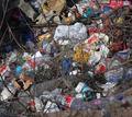
| Neat idea but the clutter on the left works against the message. |
|
|
|
03/18/2008 10:18:57 PM |
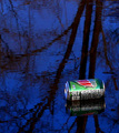
| Maybe cropping it portriat and using the right side would have made it more powerful. The trees and road were not very interesting |
|
|
|
03/14/2008 01:17:40 AM |
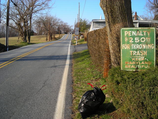
| Funny idea. The crop seems a little tight on the bottom and right side. |
|
|
|
03/13/2008 10:32:58 AM |
| This photograph is very balanced. It seems like the colors are on one side and the gray road is on the other. I also appreciate the irony. |
|
|
|
03/12/2008 07:15:45 PM |
| That looks like a very strategically placed bag of garbage. |
|
|
|
03/12/2008 06:28:39 PM |
| Nice prespective and idea for the challenge, well done. |
|
|
|
03/12/2008 03:40:34 PM |
|
|
|
03/12/2008 02:15:28 AM |
| The sign looks trashier than the trash. You'd think if they were really concerned with beauty they could at least cover the rust once in a while! :) |
|
Home -
Challenges -
Community -
League -
Photos -
Cameras -
Lenses -
Learn -
Help -
Terms of Use -
Privacy -
Top ^
DPChallenge, and website content and design, Copyright © 2001-2025 Challenging Technologies, LLC.
All digital photo copyrights belong to the photographers and may not be used without permission.
Current Server Time: 03/18/2025 03:30:37 PM EDT.