| Author | Thread |
|
|
04/01/2004 10:04:44 PM |
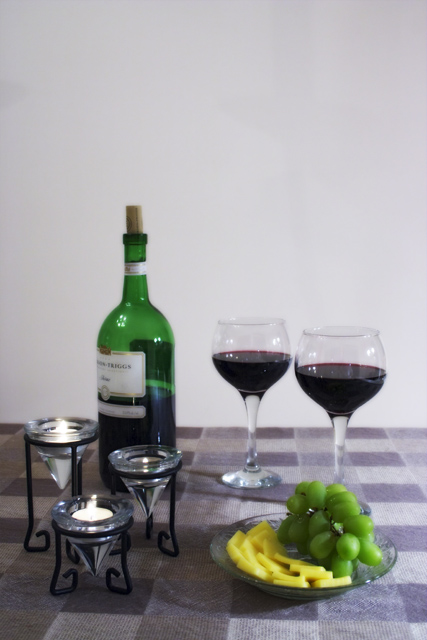
| Alright your picture would never make it to the editors table to even think about a page in or on the cover of a magazine unless it was about bad photography! Your image is very blurry you have to many things in your photograph that cause problems. There is no dynamic angle to follow with your eye since there is so much stuff. The lighting forget it about it. The reflections is the least of your problem and a softer light you need more light its a completely flat and dull image you need light boxes and a tent for this image. Good luck! |
|
 Photographer found comment helpful. Photographer found comment helpful. |
Comments Made During the Challenge  |
|
|
03/26/2004 10:57:02 PM |
| a bit blurry. also, try a deep gold on the back wall |
|
| Photographer found comment helpful. |
|
|
03/26/2004 03:17:18 PM |
| IThe photo looks a little bit out of focus - might be my screen. However, I like the composition and the contrasting colors. |
|
| Photographer found comment helpful. |
|
|
03/26/2004 02:14:28 PM |
| Nice composition of the subject elements... But the background is, well, empty. You should have put something colorfull behind it. And I don't think the soft focus works here. There should be something that's in perfect focus. Lighting is a little weak. |
|
| Photographer found comment helpful. |
|
|
03/25/2004 06:07:10 PM |
| Nice composition, but a few things let this down. The picture must be sharp and in focus! The reflections on the bottle and glasses are distracting. The lighting needs to be much softer, the shadows look unintentional and too sharp. There are burnt out highlights on your candles. It's a shame about the marks on your background. Your tablecloth doesn't quite work for me, as it looks like you've gone for a symmetrical composition but not quite managed it. I would have taken this shot with the wine and cheese taking up more of the shot. Basicallly lighting is everything in a shot like this, and it looks like you haven't thought about it enough. Have you tried with several lamps, most or all of them diffused in one way or another? A tripod is a must as well. If your camera allows it, extend your dof. |
|
| Photographer found comment helpful. |
|
|
03/25/2004 03:42:08 PM |
| I really like the way you've set up this still life. However, the picture itself would be better if the focus were improved and the lighting. The angle of the lighting is unflattering to the subject and casts unflattering shadows in the picture. |
|
| Photographer found comment helpful. |
|
|
03/25/2004 02:01:36 PM |
Great composition but a little unsharp, smaller aperature would improve this.
the lighting is pretty good. |
|
| Photographer found comment helpful. |
|
|
03/25/2004 12:40:38 PM |
|
| Photographer found comment helpful. |
|
|
03/25/2004 07:01:12 AM |
| Nice idea, goos use of negatice space for titles etc just lacking that crisp focus. |
|
| Photographer found comment helpful. |
|
|
03/24/2004 04:26:44 PM |
| Don't like the soft focus |
|
| Photographer found comment helpful. |
|
|
03/24/2004 12:13:42 PM |
| a little bit soft but nice composition |
|
| Photographer found comment helpful. |
|
|
03/23/2004 09:15:53 PM |
| The wine bottle and glasses should be the center of attention for a wine magazine but in this image they are out of focus. |
|
| Photographer found comment helpful. |
|
|
03/22/2004 10:50:18 PM |
| I love how repetative this is without being overly so... the green from the bottle to the grapes, 2 glasses, 3 candles. Really well composed. |
|
| Photographer found comment helpful. |
|
|
03/22/2004 08:11:50 PM |
| Very out of focus. It might have been intended, but it does not seem to work here. |
|
| Photographer found comment helpful. |
|
|
03/22/2004 07:48:03 PM |
One of the best composites I've seen in this challenge, with excellent space for a magazine title, but it could be more in focus? Seems a bit blurry on my screen.
|
|
| Photographer found comment helpful. |
|
|
03/22/2004 06:50:13 PM |
|
| Photographer found comment helpful. |
|
|
03/22/2004 06:21:49 PM |
| nice concept! I think if the background was a solid color, it would bring the compostion together,also focus could be better |
|
| Photographer found comment helpful. |
|
|
03/22/2004 10:50:06 AM |
| A nice setup, but it seems a little blurry to me. |
|
| Photographer found comment helpful. |
|
|
03/22/2004 07:58:39 AM |
| Good composition, but I don't like the soft focus and far too much 'dead' space above |
|
| Photographer found comment helpful. |
|
|
03/22/2004 06:49:58 AM |
| Well made magazine cover. You have even made space for the logo at the top. Good colour-combination. |
|
| Photographer found comment helpful. |
Home -
Challenges -
Community -
League -
Photos -
Cameras -
Lenses -
Learn -
Help -
Terms of Use -
Privacy -
Top ^
DPChallenge, and website content and design, Copyright © 2001-2025 Challenging Technologies, LLC.
All digital photo copyrights belong to the photographers and may not be used without permission.
Current Server Time: 04/26/2025 04:22:38 PM EDT.