| Author | Thread |
|
|
03/19/2008 09:05:35 AM |
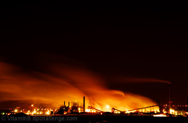
| Absolutely love this shot, I pass this all the time going up to my family's in Burlington, I got a shot of it myself, and was wondering if someone would capture this for the challenge. I love the use of negative space and the gold glow. Congrats on top 10! |
|
 Photographer found comment helpful. Photographer found comment helpful. |
|
|
03/19/2008 12:12:49 AM |
| congrats on your personal best. I guess I was wrong about the negative space comment, voters seemed to have loved it. |
|
| Photographer found comment helpful. |
Comments Made During the Challenge  |
|
|
03/18/2008 06:02:56 PM |
| You chose a perfect title for this photo. Great colours. |
|
| Photographer found comment helpful. |
|
|
03/18/2008 05:53:23 AM |
|
| Photographer found comment helpful. |
|
|
03/17/2008 10:25:18 AM |
| the sharpness of your photo makes it stand out |
|
| Photographer found comment helpful. |
|
|
03/17/2008 02:47:19 AM |
| I like how the long exposure creates a flow in the smoke. |
|
| Photographer found comment helpful. |
|
|
03/15/2008 11:13:42 AM |
| Like the use of negative and vivid colours.. |
|
| Photographer found comment helpful. |
|
|
03/14/2008 08:56:42 PM |
| I really like the fact that you left the black negative space above the flames. Nice job. |
|
| Photographer found comment helpful. |
|
|
03/14/2008 12:16:42 PM |
| Great photo, might be better with a little less sky dominating the image. |
|
| Photographer found comment helpful. |
|
|
03/14/2008 10:08:04 AM |
| I like the color that the fire, thing, creates |
|
| Photographer found comment helpful. |
|
|
03/14/2008 09:13:59 AM |
| Very nice shot. I like how the light is dragging in the backround and is a vibrant orange. |
|
| Photographer found comment helpful. |
|
|
03/14/2008 03:48:13 AM |
| I think too much empty space. A tighter crop would have helped alot I think. |
|
| Photographer found comment helpful. |
|
|
03/13/2008 10:36:27 PM |
| Bright and beautiful though I might have cropped in another quarter of the frame from the left and brought the top down some. |
|
| Photographer found comment helpful. |
|
|
03/13/2008 09:28:01 PM |
|
| Photographer found comment helpful. |
|
|
03/13/2008 10:17:11 AM |
| Amazing color shades and reflection/refraction involved. The steam or smoke has great shape and form. |
|
| Photographer found comment helpful. |
|
|
03/13/2008 09:38:09 AM |
| if there was more in the foreground. |
|
| Photographer found comment helpful. |
|
|
03/12/2008 09:46:16 PM |
| too much negative space... needs to be cropped differently |
|
| Photographer found comment helpful. |
|
|
03/12/2008 09:25:21 PM |
| A good subject, well exposed. Would have loved a closer look at this though, with the subject occupying more of the photo. I think that would help with the impact of the shot. |
|
| Photographer found comment helpful. |
|
|
03/12/2008 02:14:17 PM |
| masterfully exposed. do you have any outtake of this image with just a little faster shutter speed than this one though? i like this one nonetheless |
|
| Photographer found comment helpful. |
|
|
03/12/2008 11:20:41 AM |
|
| Photographer found comment helpful. |
|
|
03/12/2008 09:06:29 AM |
| This pic really brings out the fury of the plant. It reminds me of Mordor... |
|
| Photographer found comment helpful. |
|
|
03/12/2008 07:17:07 AM |
| Does give the scorched earth effect with the long exposure but to me it looks a little over-exposed. |
|
| Photographer found comment helpful. |
|
|
03/12/2008 02:39:45 AM |
| Brilliant colors. It almost looks like the place is on fire. |
|
| Photographer found comment helpful. |
|
|
03/12/2008 01:46:31 AM |
| I see where you were going with this but i feel like there is a tad too much negative space up top, composition doesn't feel right with me. Excellent clarity, 7 |
|
| Photographer found comment helpful. |
Home -
Challenges -
Community -
League -
Photos -
Cameras -
Lenses -
Learn -
Help -
Terms of Use -
Privacy -
Top ^
DPChallenge, and website content and design, Copyright © 2001-2025 Challenging Technologies, LLC.
All digital photo copyrights belong to the photographers and may not be used without permission.
Current Server Time: 03/12/2025 01:55:08 AM EDT.