| Author | Thread |
|
|
03/24/2008 05:38:16 AM |
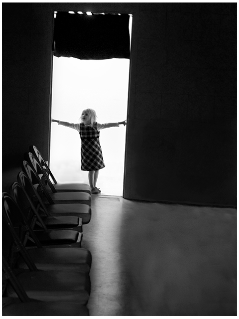
| I very much like the darkening of the row of chairs that leads to her - that works well. Not sure about the cloning of the ones on the right - maybe leave them and see how you like it. |
|
 Photographer found comment helpful. Photographer found comment helpful. |
|
|
03/23/2008 10:02:32 AM |
| I like the original just because I can see where you cloned. I would burn that area..it is brighter than the original floor. |
|
| Photographer found comment helpful. |
|
|
03/16/2008 09:56:08 PM |
| i prefer the orginal edit though it does seem more open to the right now. |
|
| Photographer found comment helpful. |
|
|
03/15/2008 09:01:21 PM |
I wonder if you did a vignaette layer so you could only barely see the chairs on the right but the middle part was lit up ??? I love the photo just like it is. It just has a great mood to it.
|
|
| Photographer found comment helpful. |
|
|
03/14/2008 11:52:44 PM |
It looks great with the chairs removed, the chairs are a little to distracting for me in the original. Your model provides quite an impact in the doorway but otherwise it seems to be missing something. Not sure what to do about it though.
|
|
| Photographer found comment helpful. |
|
|
03/13/2008 11:32:10 PM |
| I prefer this version over the other. It's more intimate and mysterious. In this version I get the sense that she just walked into this doorway and is hesitant to continue. There's a big open space on the right - what lurks there? Only a child's mind knows. |
|
| Photographer found comment helpful. |
|
|
03/13/2008 11:27:36 PM |
| you know, i think i like the orginal better, its more candid |
|
| Photographer found comment helpful. |
Home -
Challenges -
Community -
League -
Photos -
Cameras -
Lenses -
Learn -
Help -
Terms of Use -
Privacy -
Top ^
DPChallenge, and website content and design, Copyright © 2001-2025 Challenging Technologies, LLC.
All digital photo copyrights belong to the photographers and may not be used without permission.
Current Server Time: 04/18/2025 02:24:13 AM EDT.