| Photograph Information |
Photographer's Comments |
Challenge: Magazine Cover Revisited (Advanced Editing I)
Camera: Olympus C-730UZ
Location: Chicago, IL
Date: Mar 21, 2004
Aperture: f4.0
ISO: 64
Shutter: 1/160
Galleries: Cityscape, Architecture
Date Uploaded: Mar 21, 2004
|
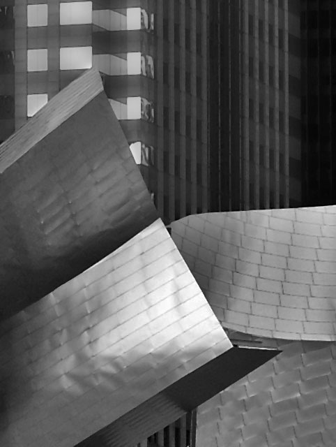
Metropolis Magazine examines contemporary life through design--architecture, interior design, product design, graphic design, crafts, planning, and preservation.
The photograph is of Frank Gehry-designed band shell in Chicago now under construction.
Tech: contrast masking, brightness and contrast, gaussian blur, dust and scratches, and median, cropping, resize and unsharp mask. |
| Author | Thread |
Comments Made During the Challenge  |
|
|
03/26/2004 12:12:04 PM |
| Nice shot, and a good magazine cover, with a vertical format and space at the top that could carry type without spoiling the picture. |
|
 Photographer found comment helpful. Photographer found comment helpful. |
|
|
03/26/2004 03:34:16 AM |
| I get a feeling of designed chaos from this picture. All the textures and shapes are great. At first, I didn't like how the post processing flatened out all the details, but as I have looked, I can see how they add to the purely graphic presentation. I think a stark contrast would make this more graphic. |
|
| Photographer found comment helpful. |
|
|
03/23/2004 03:37:43 PM |
| i really like your shot. the only thing that i could recommend, is possibly more tonal range. the composition is really nice. one of the better shots i've seen so far. |
|
| Photographer found comment helpful. |
|
|
03/23/2004 02:50:12 PM |
| Is this Disney Hall? It's a bit grey. Need more whites and blacks in the photo. I think perhaps a brighter day or a longer exposure on an f22 aperature. :) |
|
| Photographer found comment helpful. |
|
|
03/23/2004 12:16:37 AM |
| More contrast!!! I want to see dark black and whiter whites here but don't. :( The composition is very interesting however. |
|
| Photographer found comment helpful. |
|
|
03/22/2004 05:53:59 PM |
| A nicely composed image which would work well as a cover because of the obvious space for magazine title towards the top. The strong glare/ reflection on the metallic foreground is the main negative for me. |
|
| Photographer found comment helpful. |
|
|
03/22/2004 04:43:16 PM |
| Excellent! Nice shades of grey. |
|
| Photographer found comment helpful. |
|
|
03/22/2004 08:53:59 AM |
| Graphically interesting. Good composition. I had like to see how it was in color. |
|
| Photographer found comment helpful. |
Home -
Challenges -
Community -
League -
Photos -
Cameras -
Lenses -
Learn -
Help -
Terms of Use -
Privacy -
Top ^
DPChallenge, and website content and design, Copyright © 2001-2025 Challenging Technologies, LLC.
All digital photo copyrights belong to the photographers and may not be used without permission.
Current Server Time: 03/12/2025 09:27:00 AM EDT.