| Author | Thread |
Comments Made During the Challenge  |
|
|
03/25/2008 09:09:29 PM |
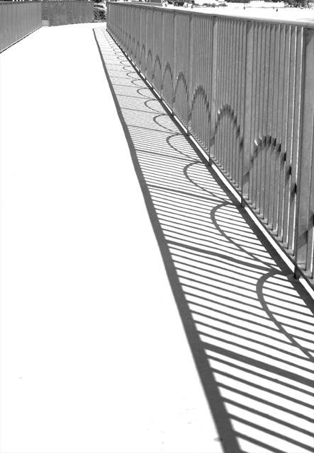
| Needs a little more contrast for impact. Maybe a little too tall and stretched out. |
|
|
|
03/25/2008 06:33:07 PM |
I like the long leading lines and the repeating ellipses along the diagonal.
Might be nicer cropped down a bit on the top and just a little on the left. This would simplify the image and make it stronger in my opinion. Still very nice. |
|
|
|
03/25/2008 10:26:35 AM |
| Nice image. There seems to be some dust or something on your lense or filter bottom right. |
|
|
|
03/22/2008 09:59:24 PM |
| Excellent composition and lighting! 10. |
|
|
|
03/21/2008 10:45:37 AM |
| Very nice, however, I think it would have been better cropped in from the left. As it is, I'm not fond of the large expanse of white. (I haven't decided if I like the lack of detail in the white or not as it makes the image very graphical as it is.) |
|
|
|
03/21/2008 05:29:07 AM |
| I feel you might have been better cropping off a little of the empty space |
|
|
|
03/20/2008 06:31:52 PM |
| Great angle. Very contemporary feeling. I would have cropped out the top background bit to where the walkway starts to curve for a total geometric/abstract feeling to this. Then I would have pumped the contrast up a notch. But that's me. Really like it though. |
|
 Photographer found comment helpful. Photographer found comment helpful. |
|
|
03/19/2008 06:21:05 AM |
| A tighter crop would improve this a great deal - remove the top of the fence and the fence on the left completely so we're just left with the main fence and shadows. |
|
| Photographer found comment helpful. |
Home -
Challenges -
Community -
League -
Photos -
Cameras -
Lenses -
Learn -
Help -
Terms of Use -
Privacy -
Top ^
DPChallenge, and website content and design, Copyright © 2001-2025 Challenging Technologies, LLC.
All digital photo copyrights belong to the photographers and may not be used without permission.
Current Server Time: 03/11/2025 01:45:48 PM EDT.