| Author | Thread |
|
|
10/10/2002 09:15:00 AM |
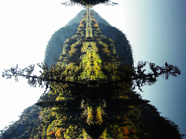
| I voted this pretty high, as I thought the rotation was intentional. It is a much better picture in the submitted aspect than it was when I straightened it out! This sort of focusing on the forms and shapes, rather than the actual things they 'are' is really interesting to me just now. Turning it on its side like this makes the sky, lake, trees all irrelevent and focuses on the shapes. |
|
|
|
10/07/2002 10:53:00 AM |
| Raspii, I simply did not understand the purpose in the rotation. Creative as it may be, I just asked myself why and couldn't come up with an answer... It's still a nice shot :) |
|
|
|
10/07/2002 10:40:00 AM |
| I gave this a 9. I thought the rotation was a good, creative idea. |
|
|
|
10/07/2002 09:53:00 AM |
| Wow! I'm glad to see a very bold creative move that didn't get shot down! Sure, it could have placed higher, but it made top 50 which is top 20% in this case. And you didn't even end up with a more than normal number of 1-4s. That must be very gratifying. Good work. |
|
|
|
10/07/2002 09:53:00 AM |
| For those of you (probably not the ones reading this) who doubted or scored me lower because of it, the rotation was indeed intentional. While I lost some points for doing it, I gained more than I lost. Thanks to all who took the time to see and understand. |
|
|
|
10/07/2002 12:53:00 AM |
| Too bad, I really think this would do much better...great creativity bud |
|
Comments Made During the Challenge  |
|
|
10/06/2002 01:56:00 PM |
| Like the abstract graphic treatment of the natural subject |
|
|
|
10/06/2002 08:38:00 AM |
Initial=cool abstract
Composition=would almost be convincing if the sky was as grey as the water
Clarity (focus, details)=hard for me to tell if you intended for this to be soft or not
Exposure=fair
Interesting or Emotive=interesting in the horizontal if that is what you intended.
I am using a this new detailed commenting method inspired by autool. (Thanks
autool!). I hope you find it more helpful than my former comments.
Thanks for submitting, and good luck! ;0)
|
|
|
|
10/05/2002 05:09:00 AM |
| Very unusual and interesting--good colours--seeing it sideways adds to the drama andrewm |
|
|
|
10/05/2002 01:50:00 AM |
|
|
|
10/04/2002 11:01:00 PM |
| This is a good picture, Ilike your imagination. |
|
|
|
10/04/2002 01:18:00 PM |
| should have called this "Rorschach". clever 'twist' on well executed shot. (10) ~mcmurma |
|
|
|
10/04/2002 12:00:00 PM |
|
|
|
10/03/2002 11:46:00 PM |
| rotate 90degrees please... 1 |
|
|
|
10/03/2002 05:31:00 PM |
I like the rotation - makes it more abstract and less like a typical pretty but low impact scenery photo. Nice colours.
Sky looks very very white.
Kavey |
|
|
|
10/03/2002 01:39:00 AM |
| the rotation makes this really abstract, and almost fractal-like. Was it intentional ? |
|
|
|
10/02/2002 11:09:00 PM |
| I like your rorschach effect..makes a very interesting piece. |
|
|
|
10/02/2002 09:04:00 PM |
|
|
|
10/02/2002 08:39:00 PM |
| I am assuming that this is in the correct position. I really like the kaleidescope effect you made by rotating this. It would have been a fine photo on its own but I believe it is better this way. Good job. DPz |
|
|
|
10/02/2002 08:37:00 PM |
| this would have been more appealing if i didn't need to tilt my own head for the orientation but great reflection. |
|
|
|
10/02/2002 06:27:00 PM |
| Extra points for turning it on its side |
|
|
|
10/02/2002 02:39:00 PM |
| Why not rotated to a normal position ? Shadows are without details. Fiarly standard picture. |
|
|
|
10/02/2002 08:12:00 AM |
| Well wierd ink blot! Smart idea. |
|
|
|
10/02/2002 02:46:00 AM |
| I'm sure you'll get many people saying it should be portrait rather than landsape, but I like it this way. It's like one of those psychology ink-blot things! |
|
|
|
10/02/2002 01:25:00 AM |
| yep, you're right, it looks better this way. Sorry, just joking. Great shot and well worth the sore neck. |
|
|
|
10/01/2002 11:46:00 PM |
| Sideways is distracting. This hurt my neck. Right-side up, this is a good picture - sharp colors, reminiscent of an ink blot - 7. |
|
|
|
10/01/2002 10:15:00 PM |
| It looks like a grizzly bear with a mustache...I love it. It took a lot of guts for you to rotate it and submit it like this...I submitted my photo upside down...I hope others see the creativity as well as a great shot... 10 - zadore |
|
|
|
10/01/2002 06:27:00 PM |
| wow, this looks really neat. when i first saw it i thought why isn't this turned right side up, but the more i look at it the more i really like the symmetry of it this way. great job. |
|
|
|
10/01/2002 02:23:00 PM |
| A good solid 8. Perhaps more on a second look. JEM |
|
|
|
10/01/2002 12:55:00 PM |
| Did you forget to orient your pic? It's kinda hard to view sideways. I like the color, but the blown out sky is really harsh. The only suggestion I think I could make would be, crop out the sky and display in landscape. The reflection up to the shoreline would have worked great for me, or maybe just a little above it. (Tried "hand cropping, seems much better!) 6 Swash |
|
|
|
10/01/2002 10:30:00 AM |
| The angle totally took me by surprise. People will either love it, or they'll hate it. Personally, I love the fractal like pattern you have framed here; this is just surreal� I keep looking and I keep thinking, yup this is great� (10) |
|
|
|
10/01/2002 07:55:00 AM |
| Is this supposed to be sideways? Looks like a nice shot when I turn my head. :) |
|
|
|
10/01/2002 05:28:00 AM |
| interesting way to make this shot sort of abstract. |
|
|
|
10/01/2002 03:27:00 AM |
| that is an awesome angle that you put this on here. Very original and it looks like a bug. 9 -Jubei |
|
|
|
10/01/2002 01:00:00 AM |
| Nice angle on a water pic. Good job! |
|
|
|
10/01/2002 12:45:00 AM |
| The orientations gives this a really cool abstract appearance. I like the colors and composition. karmat |
|
|
|
09/30/2002 10:08:00 PM |
| Wow... this is a great shot! It took me a minute to figure out that I needed to turn my head sideways :) Did you intend to post it 90 degrees to the left? :) I'll comment on it as if you did... The symetry is awesome. The entire shoreline is reflecting, so you a perfect replica. The reflection is clear and obvious, great DOF - everything seems to be in focus.. Beautiful colors... Well worth a 10 - JB |
|
|
|
09/30/2002 09:50:00 PM |
|
|
|
09/30/2002 09:13:00 PM |
| I like it done this way. Makes me think of an ink blot~ Great reflection. Unusual approach. |
|
|
|
09/30/2002 07:12:00 PM |
| very nice reflection. did you submit it sideways on purpose? perhaps to make the viewer guess the orientation? perhaps to make us appreciate the shapes of the picture? Well anyways, it has great color. The only thing th�t really bothers me is the overexposed sky, but that's a toughie to fix. You could wait around until the sky darkens, but who has that kind of time? |
|
|
|
09/30/2002 06:56:00 PM |
| You are right--more interesting 90 deg. counter clockwise!!! |
|
|
|
09/30/2002 06:11:00 PM |
| really nice picture! Did you intentionally didn't rotate it??? I imagine it would be rotated right and give it a 7 for great colors and nice motif! |
|
|
|
09/30/2002 05:22:00 PM |
Would have to be vertical.... :-((
|
|
|
|
09/30/2002 12:14:00 PM |
| interesting rotation of the canvas! |
|
|
|
09/30/2002 09:37:00 AM |
EXCELLENT PICTURE!!!
Next time jus rotate it!
Solid 8 for me! Richi |
|
|
|
09/30/2002 09:04:00 AM |
| Wow. Excellent choice. I'm not even tempted to turn my head sideways and see the real image. Your decision here really turned a run of the mill landscape shot into an evocative study in form and negative space. I can make out a face in the image (in the way that children make images in clouds...) Well done. 9, just-married |
|
|
|
09/30/2002 12:41:00 AM |
| Beautiful shot.. i would like it much more rotated 90 degrees clockwise... - setzler |
|
Home -
Challenges -
Community -
League -
Photos -
Cameras -
Lenses -
Learn -
Help -
Terms of Use -
Privacy -
Top ^
DPChallenge, and website content and design, Copyright © 2001-2025 Challenging Technologies, LLC.
All digital photo copyrights belong to the photographers and may not be used without permission.
Current Server Time: 03/13/2025 03:45:08 PM EDT.