| Author | Thread |
Comments Made During the Challenge  |
|
|
04/07/2008 10:06:54 PM |
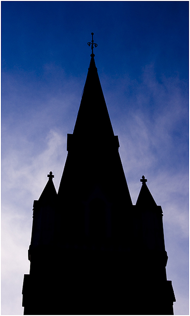
| very interesting in term of graphic. The dark/building part could be smaller to bring out the contract of sky. |
|
 Photographer found comment helpful. Photographer found comment helpful. |
|
|
04/03/2008 11:15:59 AM |
| Its good that church is silhoetted so it doesnt ruin the 'only cool colors" thing, and the sky is nice. Just too much negative space with the church |
|
| Photographer found comment helpful. |
|
|
04/03/2008 10:25:00 AM |
| I like how the church turned out to be completly black against the backround |
|
| Photographer found comment helpful. |
|
|
04/03/2008 10:24:14 AM |
| This picture doesnt really meet the cool color objective. The subject is black, which isnt a cool color. |
|
| Photographer found comment helpful. |
|
|
04/02/2008 10:40:08 PM |
| Shot is too centered. Great exposure of the sky and clouds though. |
|
| Photographer found comment helpful. |
|
|
04/02/2008 04:36:52 PM |
| This kind of shot demands dead-on symmetry. The sky is well done. |
|
| Photographer found comment helpful. |
|
|
04/02/2008 09:27:54 AM |
|
| Photographer found comment helpful. |
Home -
Challenges -
Community -
League -
Photos -
Cameras -
Lenses -
Learn -
Help -
Terms of Use -
Privacy -
Top ^
DPChallenge, and website content and design, Copyright © 2001-2025 Challenging Technologies, LLC.
All digital photo copyrights belong to the photographers and may not be used without permission.
Current Server Time: 03/12/2025 03:11:58 PM EDT.