| Author | Thread |
|
|
04/23/2008 11:55:27 AM |
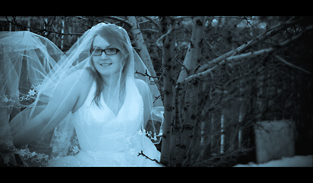
| Color balance aside I don't care for the photo. I don't think the setting really works for a bridal shoot. The background is cluttered and my eye was drawn directly to the chunk of plywood leaning against the fence. Then I start to notice the small brances protruding into the bride. Finally, the black border on the top and bottom just doesn't work for me. The bride herself is good. You've captured a really good expression, she seems very relaxed with you (which is a real positive in any portrait). |
|
|
|
04/23/2008 10:05:19 AM |
| Looks ghoulish. Not exactly what one wants to see in a bridal portrait. And what is the point of the right half of the frame? It would be much better cropped to just the bride. |
|
|
|
04/23/2008 09:41:42 AM |
You got some good feedback in the comments during the challenge. Mostly I think what may have hurt this in the challenge is the use of a cool overtone, rather than shooting cool colors. There are a lot of folks who vote based on strict adherence to the challenge theme and would consider this simply taking a normal shot and adding a cool tone to it to meet the challenge, whether that's what you did or not. The composition strikes me as just a bit odd, though that may not necessarily be bad (just may be bad for the score) in that the right side is empty and seems to serve no purpose. Unless you look at it as that's where the groom should be and he isn't, which creates an interesting sort of morose sadness. I don't suspect that's what you were going for.
As for scores here - as usual, the simple, the clean, the more direct interpretations of the challenges will garner higher scores. On some occasions, busy will work but it has to be pretty spectacular. Lately, adherence to challenge topic has been of significant importance, and it has to be very clear how it relates, not something one must think about.
As for this picture - I rather like it except would prefer it cropped a bit on the right. You have a very good expression from your bride, and good flow with the veil in the trees. |
|
 Photographer found comment helpful. Photographer found comment helpful. |
Comments Made During the Challenge  |
|
|
04/08/2008 06:11:59 PM |
| beautiful portrait, nice vignetting on the R, although I think a closer crop on the R would have improved the photo some. still nice job |
|
| Photographer found comment helpful. |
|
|
04/08/2008 09:48:26 AM |
| this isnt really that much of a cool colors. |
|
|
|
04/07/2008 09:43:16 AM |
| i think that maybe taking a picture of cool colors, not giving something cool colors would be better |
|
|
|
04/07/2008 09:30:13 AM |
| interesting idea, i like the measure of cropping here. |
|
| Photographer found comment helpful. |
|
|
04/06/2008 12:21:56 PM |
| Was this shot with a filter on the lens? It is a really nice image and very unexpected. |
|
| Photographer found comment helpful. |
|
|
04/03/2008 11:22:17 AM |
| Kind of reminds me a bit of corpse bride with the blue hue. I like her expression but the right side of your photo should have been cropped more it gets blurry and boring. (just half an inch i think...) i also like how her arms seem to disapear. |
|
| Photographer found comment helpful. |
|
|
04/02/2008 11:07:16 PM |
| The branches on the tree seem to be more in focus than the bride. There is too much competing for attention in this shot when I think the shot is intended to bring attention to the bride. |
|
| Photographer found comment helpful. |
|
|
04/02/2008 04:50:02 PM |
| Intriguing, in a surreal sort of way. |
|
| Photographer found comment helpful. |
|
|
04/02/2008 03:06:19 PM |
| i dont appreicate the black border and the blue tone together |
|
| Photographer found comment helpful. |
Home -
Challenges -
Community -
League -
Photos -
Cameras -
Lenses -
Learn -
Help -
Terms of Use -
Privacy -
Top ^
DPChallenge, and website content and design, Copyright © 2001-2025 Challenging Technologies, LLC.
All digital photo copyrights belong to the photographers and may not be used without permission.
Current Server Time: 03/18/2025 10:46:29 AM EDT.