| Author | Thread |
|
|
04/17/2008 07:08:25 AM |
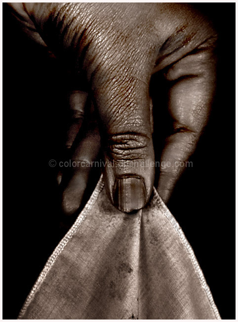
| I try not to pay too much attention to titles- since more times than not too little attention s paid to an image in my opinion :) I think your composition is graceful and nicely done- sharp and creates beautiful shapes; the lighting/shadows are well executed- and its a pity this didn't finish much higher |
|
 Photographer found comment helpful. Photographer found comment helpful. |
|
|
04/14/2008 02:50:47 AM |
Hahaha, well the first line of your comments made me laugh (depressingly true)
Strange photo, in that from a personal taste point of view I have to say it doesnt really do it for me BUT from a technical point of view I thought it was really well done and a strong image
I quite liked the paradox between the title (and subject) amd the grime of the image |
|
| Photographer found comment helpful. |
|
|
04/14/2008 02:33:44 AM |
| a very striking image. almost looks bronzed... with a snakeskin shine. i especially like the stains on the hankie. |
|
| Photographer found comment helpful. |
|
|
04/14/2008 01:21:06 AM |
| Great composition and idea. Must admit to not being too fond of the processing either, but I never expect to like everything. Wonderful detail. |
|
| Photographer found comment helpful. |
|
|
04/14/2008 12:19:26 AM |
OMG......this is a great image! A dirty hand, daintily picks up a hankerchief, trying not to dirty it!
Contrary to some voter's tastes.....I think that the processing actually MAKES this shot.
But, then again, there's always going to be those who will want you to rip out a wall, change the color of someone's hair, pose the model upside down and completely overhaul your shot in order for them to "like it"! *grin*
Great Job Michelle! I didn't vote in this challenge, but I love this shot! Keep up the good work. Just because it doesn't fit into DPC challenge "criteria" of "pretty", doesn't mean that it lacks value and merit elsewhere! *smile*
PS: Perhaps, a "dirty booby" might have scored higher! But, then again, one never knows in here! *wink*
Message edited by author 2008-04-14 00:21:04. |
|
| Photographer found comment helpful. |
Comments Made During the Challenge  |
|
|
04/10/2008 09:18:52 PM |
| Good, though the treatment does not appeal to me personally. It makes it look more like a man's rough hand than a woman's dainty one. Or is it actually a man's hand? |
|
| Photographer found comment helpful. |
|
|
04/10/2008 07:28:29 PM |
| The handkerchief looks like it's changing oil. The contrast is a little blown out on this one. I think by working with the highlights a little you could make it a stronger image. |
|
| Photographer found comment helpful. |
|
|
04/09/2008 11:57:14 PM |
| Nice image - Let down by technical skills - Lack of sharpness |
|
| Photographer found comment helpful. |
|
|
04/08/2008 10:04:46 AM |
| beautiful- I like the shapes, the tones, and overall the whole image! :) the traingles draw my eye (10) |
|
| Photographer found comment helpful. |
|
|
04/07/2008 05:48:56 PM |
You may not like what I have to say. Yes, it's a hand so it meets the challenge. Personally I do not like images that are overprocessed, especially images of hands that are overprocessed making them look old, wrinkled and dirty. Your focus seems a bit soft here. Your title does not go with the photo. You say dainty but it is a dirty looking hand with a dirty handkerchief.
That being said, I think there are good points to the photo. The composition is good as is the black background. If you had toned down the processing some and had a frilly or lace hankie I think it would look a lot better. |
|
| Photographer found comment helpful. |
|
|
04/07/2008 03:38:18 PM |
| great details and textures, good b/w conversion |
|
| Photographer found comment helpful. |
|
|
04/07/2008 12:33:00 AM |
| strange contradictory image. I actually thought the cloth was a knife blade in the thumbnail. But even now that I know what it is the editing and the dark colors make me think anything but dainty. |
|
| Photographer found comment helpful. |
Home -
Challenges -
Community -
League -
Photos -
Cameras -
Lenses -
Learn -
Help -
Terms of Use -
Privacy -
Top ^
DPChallenge, and website content and design, Copyright © 2001-2025 Challenging Technologies, LLC.
All digital photo copyrights belong to the photographers and may not be used without permission.
Current Server Time: 03/12/2025 03:36:27 AM EDT.