| Author | Thread |
Comments Made During the Challenge  |
|
|
04/06/2004 06:03:41 AM |
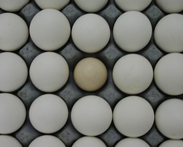
| With most of the out of place entries, the subject that is out of place needs to be the center of attention, but this I think is good enough it would have been made better by placing the out of place item out of center. It draws the eye to itself, no need to force it. |
|
 Photographer found comment helpful. Photographer found comment helpful. |
|
|
04/05/2004 10:35:47 PM |
| I like your idea. you should try incrasing the contrast in photoshop to make the image stick out a little more. but good pic. |
|
| Photographer found comment helpful. |
|
|
04/05/2004 04:26:28 PM |
| One of these is not like the others |
|
|
|
04/03/2004 06:22:09 PM |
| funny idea, but too centered shot and not enough light |
|
| Photographer found comment helpful. |
|
|
04/03/2004 04:12:45 PM |
| Your eggs are flat! The little brown one almost looks the same as the rest. |
|
|
|
04/03/2004 08:44:15 AM |
|
| Photographer found comment helpful. |
|
|
04/02/2004 09:13:00 AM |
Do you mean we're?
If so - your gramatical error has SERIOUSLY degraded your photo. This lack of consideration only reflects poorly on your work and completely changed the meaning of your picture.
I'm sorry, but this really gets to me. |
|
|
|
04/02/2004 07:57:49 AM |
| The focus is a bit soft, otherwise a nice picture. |
|
| Photographer found comment helpful. |
|
|
04/01/2004 01:54:40 PM |
| I have seen this photograph just recently, or a very similiar one, in the orange contest done by another photographer. Eggs are always cool. Great idea. |
|
| Photographer found comment helpful. |
|
|
04/01/2004 11:13:04 AM |
| Focus seems off, it's a bit too symetrical for me and there really isn't that much contrast between the odd egg and the rest. |
|
| Photographer found comment helpful. |
|
|
04/01/2004 02:54:54 AM |
| kinda dark and low on contrast |
|
| Photographer found comment helpful. |
|
|
04/01/2004 02:21:02 AM |
| i would like it better if the out-of-place egg were off center and a bit more contrast and a more obligue illumination would be great ... the eggs are lacking depths and the white is not quite white enough |
|
| Photographer found comment helpful. |
|
|
03/31/2004 11:10:42 AM |
| It's a little blurry and I think your white balance might be a bit off. It all looks bluish grey to me. I'll check it on a different monitor later. Nice idea though, and I like the angle. |
|
| Photographer found comment helpful. |
|
|
03/31/2004 04:26:54 AM |
| Lighting is very poor. And focus is too bad, the image it´s blurry. |
|
| Photographer found comment helpful. |
|
|
03/31/2004 12:50:15 AM |
| The entire frame seems soft in the focus department. |
|
| Photographer found comment helpful. |
Home -
Challenges -
Community -
League -
Photos -
Cameras -
Lenses -
Learn -
Help -
Terms of Use -
Privacy -
Top ^
DPChallenge, and website content and design, Copyright © 2001-2025 Challenging Technologies, LLC.
All digital photo copyrights belong to the photographers and may not be used without permission.
Current Server Time: 04/26/2025 07:17:04 PM EDT.