| Author | Thread |
|
|
01/03/2009 05:30:18 PM |
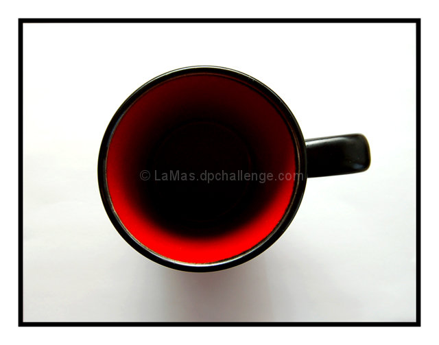
| There's something very appealing about the black circle of the cup surrounded by the black square of the frame - this works very well to keep the supposedly "boring" centered comp from being so. |
|
 Photographer found comment helpful. Photographer found comment helpful. |
|
|
04/16/2008 01:06:25 AM |
| It's like a poster for your kitchen. But weirdo that I am, I'd love to see an eye staring out of the depths. :) |
|
| Photographer found comment helpful. |
Comments Made During the Challenge  |
|
|
04/15/2008 12:56:19 AM |
| Love this minimalist shot. Good choice of colour and contrast control. |
|
| Photographer found comment helpful. |
|
|
04/14/2008 03:57:40 PM |
| But it's empty!? I need my go-go juice in the morning! |
|
| Photographer found comment helpful. |
|
|
04/14/2008 01:33:12 AM |
| I find myself wishing the handle was pointing directly at the 3 o'clock position, rather than just above. But the colours and lighting are just great.....very effective |
|
| Photographer found comment helpful. |
|
|
04/12/2008 06:57:38 PM |
|
| Photographer found comment helpful. |
|
|
04/12/2008 03:10:01 AM |
| I really like the lighting on this, it makes the cup look bottomless. The red color realy works well and while I'm not a fan of frames I think it also works well with this photo. Well done. |
|
| Photographer found comment helpful. |
|
|
04/12/2008 12:56:54 AM |
| Wonderful image.. great processing. |
|
| Photographer found comment helpful. |
|
|
04/11/2008 11:35:02 AM |
| Nice and simple. To be truly centred I'd have positions the handle vertical. |
|
| Photographer found comment helpful. |
|
|
04/11/2008 11:32:25 AM |
| Good focus and framing. Well lit as well. Looks like a nice shot for stock photography. |
|
| Photographer found comment helpful. |
|
|
04/10/2008 11:41:28 PM |
| a pleasing image that might do well in an interior decorators portfolio. 8 |
|
| Photographer found comment helpful. |
|
|
04/10/2008 05:24:30 PM |
| it appears half empty, but I am a pessimist... |
|
| Photographer found comment helpful. |
|
|
04/09/2008 09:55:43 PM |
| I know it is just a cup, but it impressed me. I don't know if its the shadows, the black frame matching the outside of the cup, or the combination of white, black and red! I liked your work a lot! 9 |
|
| Photographer found comment helpful. |
|
|
04/09/2008 01:13:28 PM |
| great colors, I love the simple, uncluttered feel of this, the border adds to the composition |
|
| Photographer found comment helpful. |
|
|
04/09/2008 10:32:26 AM |
| Clean and simple. It might be nice to see a little more detail in the mug. |
|
| Photographer found comment helpful. |
Home -
Challenges -
Community -
League -
Photos -
Cameras -
Lenses -
Learn -
Help -
Terms of Use -
Privacy -
Top ^
DPChallenge, and website content and design, Copyright © 2001-2025 Challenging Technologies, LLC.
All digital photo copyrights belong to the photographers and may not be used without permission.
Current Server Time: 03/12/2025 06:05:33 PM EDT.