| Author | Thread |
Comments Made During the Challenge  |
|
|
04/05/2004 04:17:26 PM |
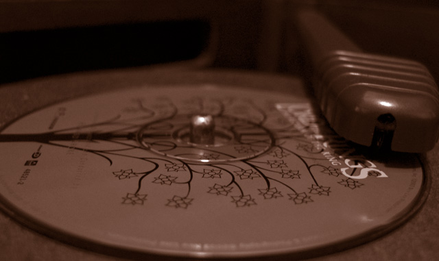
| I like the idea, but the overall picture is a bit too dark. I think it would have been nicer to see the title right side up as well. |
|
 Photographer found comment helpful. Photographer found comment helpful. |
|
|
04/05/2004 03:24:30 PM |
| lovely idea. Very dark though |
|
| Photographer found comment helpful. |
|
|
04/02/2004 02:33:04 AM |
| Could have been framed better IMO. Could also be better in full color? |
|
| Photographer found comment helpful. |
|
|
04/01/2004 12:36:59 PM |
| To dark for me but I like the idea. |
|
| Photographer found comment helpful. |
|
|
04/01/2004 06:36:05 AM |
| have I seen this CD idea in another pic? |
|
|
|
04/01/2004 06:30:23 AM |
| Everyone knows you have to put them shiny side up... I like the monochrome colors--they help convey the concept of old. It seems the spindle could be sharper to draw the eye to an important part of the subject--but without losing the shallow depth of field--perhaps a slightly different angle? Overall, nice. Good idea. Good luck! |
|
| Photographer found comment helpful. |
|
|
04/01/2004 02:22:43 AM |
| in my opinion the crop is to tight and the shot is to close. alittle to much flash reflection as well. <6> |
|
| Photographer found comment helpful. |
|
|
03/31/2004 10:02:58 AM |
| I can not make heads or tails out of this shot and the caption does not enlighten me either |
|
Home -
Challenges -
Community -
League -
Photos -
Cameras -
Lenses -
Learn -
Help -
Terms of Use -
Privacy -
Top ^
DPChallenge, and website content and design, Copyright © 2001-2025 Challenging Technologies, LLC.
All digital photo copyrights belong to the photographers and may not be used without permission.
Current Server Time: 12/14/2025 07:27:22 PM EST.