| Author | Thread |
|
|
04/30/2008 09:43:04 AM |
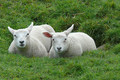
Thank you all for helpful comments.
I had to crop that narrow to left the distracting objects outside.
Refrained to saturate more to avoid unnatural look.
|
|
Comments Made During the Challenge  |
|
|
04/29/2008 10:52:43 PM |
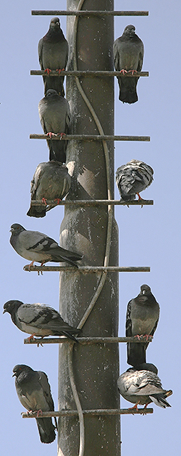
cool. There are some missing heads here. nifty work.
OK - I've decided to give this image my very latest award- the Meta Shoulda.
In this case, this shoulda won but I think it shoulda had a bit more negative space to push it over the top.
Congrats on your "shoulda". |
|
|
|
04/29/2008 08:37:07 PM |
|
|
|
04/28/2008 07:28:07 PM |
| A little plain with colors, but nice idea and capture. |
|
 Photographer found comment helpful. Photographer found comment helpful. |
|
|
04/28/2008 02:50:35 PM |
| Would prefer a more balanced pigeon arrangement for this 'Even' competition. |
|
| Photographer found comment helpful. |
|
|
04/28/2008 10:22:45 AM |
|
|
|
04/27/2008 05:27:53 PM |
| That is a very creative shot and crop. I think you did well with this one. |
|
|
|
04/27/2008 10:02:34 AM |
|
|
|
04/26/2008 12:22:00 AM |
|
|
|
04/25/2008 10:30:12 PM |
|
|
|
04/25/2008 06:35:41 PM |
|
|
|
04/25/2008 04:10:03 PM |
| Because you have those two birds that are alone, I dont think this meets the challenge all that well. I think you should've cropped it at the bottom up to the 4th row of pigeons and entered this into the "Odds" contest. |
|
| Photographer found comment helpful. |
|
|
04/25/2008 01:40:48 PM |
| Nice capture...so two of them are still bachelors...;) |
|
|
|
04/25/2008 09:51:39 AM |
| I like the balance, but the colors are a little dull. |
|
| Photographer found comment helpful. |
|
|
04/24/2008 11:31:09 PM |
| more washed out than I'd like to see... |
|
| Photographer found comment helpful. |
|
|
04/24/2008 09:04:22 AM |
| this would have been 8 or may be 9 for me, if it wasn't for this odd narrow crop. did you just decide to have this crop or there was some distracting/cluttering elements close to the subject? |
|
| Photographer found comment helpful. |
|
|
04/24/2008 08:52:30 AM |
| Nice crop. Beautiful photo. I think it would have been better with a few more tweak on the contrast. 9. |
|
| Photographer found comment helpful. |
|
|
04/24/2008 01:59:46 AM |
| yes this works but would probably score higher if there were less. |
|
| Photographer found comment helpful. |
|
|
04/23/2008 08:57:40 PM |
| The colours and contrast seem a little dull/flat. |
|
| Photographer found comment helpful. |
|
|
04/23/2008 08:16:59 PM |
| great eye! I just wonder if this couldve been taken another way, alittle boring.. |
|
| Photographer found comment helpful. |
Home -
Challenges -
Community -
League -
Photos -
Cameras -
Lenses -
Learn -
Help -
Terms of Use -
Privacy -
Top ^
DPChallenge, and website content and design, Copyright © 2001-2025 Challenging Technologies, LLC.
All digital photo copyrights belong to the photographers and may not be used without permission.
Current Server Time: 03/12/2025 03:46:29 AM EDT.