| Author | Thread |
|
|
04/30/2008 07:46:56 AM |
Thanks all
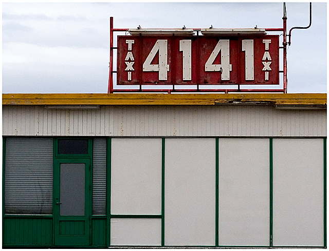
there are 12 squares in the building two of them have blinds
the sign have 4 sides 4 numbers 4+1+4+1 = 10 or 41+41=82 and the letters are 8 on 2 sides and thera are 8 pilars holdin it and finaly 2 lights,2 bords in the roof and maby even number of bords in the building and 2 lights.
Just one door but must be a back-door.
ha ha |
|
|
|
04/30/2008 04:51:11 AM |
Absolutely underrated. Is it even or is it odd? Can't decide. In any case, it's great!

|
|
 Photographer found comment helpful. Photographer found comment helpful. |
Comments Made During the Challenge  |
|
|
04/29/2008 09:33:17 PM |
|
| Photographer found comment helpful. |
|
|
04/29/2008 08:40:44 PM |
While I can see some left-right symmetries in the sign, I'll add to all the people who have undoubtably pointed out that "4141" is an odd number.
The building provides an interesting collection of horizontal and vertical lines in this image, but I'm not sure the collection of them works. For me, the focal point of the image is the sign; I can't see what is added by this particular crop of the building. |
|
| Photographer found comment helpful. |
|
|
04/29/2008 09:23:48 AM |
|
| Photographer found comment helpful. |
|
|
04/28/2008 03:20:25 PM |
| 4141 is an odd number!!! Seriously though, good composition and interesting urban pic. |
|
| Photographer found comment helpful. |
|
|
04/27/2008 07:33:10 PM |
| Not a very interesting shot. |
|
| Photographer found comment helpful. |
|
|
04/27/2008 05:08:15 PM |
| Great geometric feel and very nice colors. |
|
| Photographer found comment helpful. |
|
|
04/27/2008 09:43:18 AM |
| I like the composition, symmetry, and colors, but it' just not all that interesting. |
|
| Photographer found comment helpful. |
|
|
04/26/2008 10:10:24 PM |
| good pic, but feels like it should 'pop' some more... |
|
| Photographer found comment helpful. |
|
|
04/25/2008 04:18:42 PM |
| I see where you're going with even - but only the sign above is even. This shot is almost more asymmetrical than symmetrical! |
|
| Photographer found comment helpful. |
|
|
04/24/2008 11:00:35 PM |
| Nice parallels in the sign and in the rectangular shapes in the building. |
|
| Photographer found comment helpful. |
|
|
04/24/2008 08:53:03 AM |
| i like this simplistic composition with primary colors. just the right amount of grains and retro look helps too 7 |
|
| Photographer found comment helpful. |
|
|
04/23/2008 10:27:40 PM |
| for a pic that doesnt have much going on it really does catch my attention....the green and red both pop out at you, very nice |
|
| Photographer found comment helpful. |
Home -
Challenges -
Community -
League -
Photos -
Cameras -
Lenses -
Learn -
Help -
Terms of Use -
Privacy -
Top ^
DPChallenge, and website content and design, Copyright © 2001-2025 Challenging Technologies, LLC.
All digital photo copyrights belong to the photographers and may not be used without permission.
Current Server Time: 03/13/2025 04:15:42 AM EDT.