| Author | Thread |
|
|
06/08/2008 12:36:22 AM |
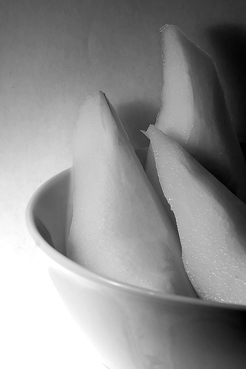
| Very nice, but I also prefer the color more. I think the bright lower left draws my eye from the fruit. |
|
 Photographer found comment helpful. Photographer found comment helpful. |
|
|
05/08/2008 11:20:51 AM |
| I like the color version of this shot better. This one seems flat and the conversion gives the appearance that the pears are the same color as the wall. |
|
| Photographer found comment helpful. |
|
|
05/04/2008 12:09:02 PM |
| There's an incongruity between the texture of the pear and the texture of the wall. I think that incongruity (which is a good thing) works a bit better in the color version. |
|
| Photographer found comment helpful. |
|
|
05/01/2008 05:59:33 AM |
| The b&w version is lacking a bit. It looks a bit flat. Composition is great though. |
|
| Photographer found comment helpful. |
|
|
04/25/2008 02:27:25 AM |
| a wonderful study in textures and tones. |
|
| Photographer found comment helpful. |
|
|
04/25/2008 12:06:49 AM |
The pear slices are beautifully sharp and pleasing minimal composition.
Side by side, the colour and black & white, and I am not sure if a comparison is really valid, depending upon actual edit & conversion - the strong yellow luminance has translated to harsh washout and awkward background gradient transition in black & white.
|
|
| Photographer found comment helpful. |
|
|
04/24/2008 10:56:00 PM |
| I think this one works better in color, my eye keeps noticing the texture from the background. |
|
| Photographer found comment helpful. |
|
|
04/24/2008 08:35:50 PM |
| Nice shapes and composition. B&W and color versions each have their merits. |
|
| Photographer found comment helpful. |
Home -
Challenges -
Community -
League -
Photos -
Cameras -
Lenses -
Learn -
Help -
Terms of Use -
Privacy -
Top ^
DPChallenge, and website content and design, Copyright © 2001-2025 Challenging Technologies, LLC.
All digital photo copyrights belong to the photographers and may not be used without permission.
Current Server Time: 04/26/2025 11:30:49 AM EDT.