| Author | Thread |
|
|
12/27/2008 10:02:30 PM |
| a bit more on levels and curves...good composition. |
|
 Photographer found comment helpful. Photographer found comment helpful. |
|
|
09/27/2008 04:01:13 PM |
| A little more contrast and stronger lighting - and this would be a fantastic image! Very neat! |
|
| Photographer found comment helpful. |
|
|
05/10/2008 07:41:01 PM |
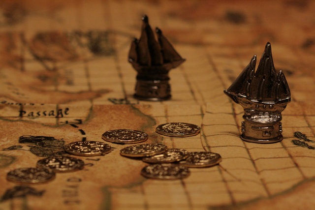
CRITIQUE CLUB CRITIQUE
by karmat
5.1????? Amazing. I truly would have expected this to score higher than this.
Compositionally, I like how the coins, ship in the foreground and ship in the background form a triangle. This makes the composition strong as well as gives the eyes something to "travel" around.
Technically, I like the lighting on this and the "tone" of the colors. I also think the shallow depth of field is particularly effective. The details are visible throughout (though I had to tilt my screen a bit to make sure).
The only thing I can think of that might make it more appealing is to make the lighting more dramatic. Maybe play with backlighting or sidelighting.
Nice work and best in future challenges.
Karma |
|
| Photographer found comment helpful. |
Comments Made During the Challenge  |
|
|
04/29/2008 03:13:31 PM |
| Lighting could be improved - the ships' sales lack detail. |
|
| Photographer found comment helpful. |
|
|
04/28/2008 12:17:38 PM |
| The focus is a little weird...but the tones are fantastic:) |
|
| Photographer found comment helpful. |
|
|
04/28/2008 12:53:37 AM |
| This looks like my kind of game, what's it called? 8 |
|
| Photographer found comment helpful. |
Home -
Challenges -
Community -
League -
Photos -
Cameras -
Lenses -
Learn -
Help -
Terms of Use -
Privacy -
Top ^
DPChallenge, and website content and design, Copyright © 2001-2025 Challenging Technologies, LLC.
All digital photo copyrights belong to the photographers and may not be used without permission.
Current Server Time: 03/17/2025 06:16:22 AM EDT.