| Author | Thread |
Comments Made During the Challenge  |
|
|
05/05/2008 05:14:26 PM |
|
|
|
05/03/2008 12:49:46 PM |
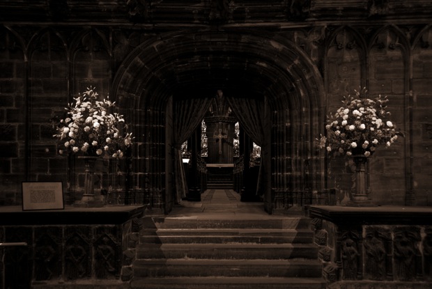
| A little dark overall. The flowers jump out because they're white but not much else. If you could dodge and burn you could bring down the brightness of the flowers and bring up the rest, but of course you can't in basic editing. |
|
 Photographer found comment helpful. Photographer found comment helpful. |
|
|
05/02/2008 05:39:09 PM |
| I can't tell if the mood is supposed to be somber or festive. |
|
|
|
05/02/2008 06:36:32 AM |
| This seems a little too dark to fully appreciate all the detail that's here. This is well centered. |
|
|
|
05/01/2008 06:41:13 PM |
| Great subject, seems a little underexposed though. |
|
|
|
05/01/2008 01:49:52 PM |
| Too dark to see the fine architectural detail...I realize you may be going for a theme, hence the darkness, for that matter, I guess it probably looks different on your monitor than mine...6. |
|
| Photographer found comment helpful. |
|
|
04/30/2008 05:46:28 PM |
|
|
|
04/30/2008 04:45:40 PM |
|
|
|
04/30/2008 03:14:05 PM |
| under exposed. shadows are lost. |
|
|
|
04/30/2008 02:52:39 PM |
| A nit too gloomy, and the slightly off centre composition doesn't really work. |
|
|
|
04/30/2008 07:16:57 AM |
|
|
|
04/30/2008 04:45:07 AM |
| I really wish you had used some fill light. I get the sensation that the altar area has some nice details, but it's too dark to see them. |
|
| Photographer found comment helpful. |
Home -
Challenges -
Community -
League -
Photos -
Cameras -
Lenses -
Learn -
Help -
Terms of Use -
Privacy -
Top ^
DPChallenge, and website content and design, Copyright © 2001-2025 Challenging Technologies, LLC.
All digital photo copyrights belong to the photographers and may not be used without permission.
Current Server Time: 03/15/2025 05:36:42 AM EDT.