| Author | Thread |
Comments Made During the Challenge  |
|
|
05/06/2008 09:05:06 PM |
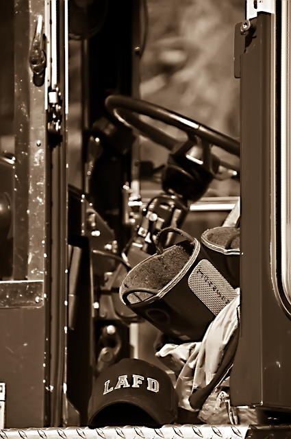
| good clarity on the hat...and nice leading lines, but it almost seems like there is too much space up top if the hat and boots are the main focus. |
|
|
|
05/03/2008 12:47:02 PM |
| Great tones and contrast. |
|
 Photographer found comment helpful. Photographer found comment helpful. |
|
|
05/01/2008 04:18:35 PM |
| Love the detail with plenty to study. Nice. |
|
| Photographer found comment helpful. |
|
|
04/30/2008 04:55:47 PM |
| Theres too much going on in the frame. I do love how sharp it is. |
|
| Photographer found comment helpful. |
|
|
04/30/2008 12:54:51 PM |
| i like the clarity of this shot, just wish it wasnt so cropped in width, i want to see more to the sides, 5 |
|
| Photographer found comment helpful. |
|
|
04/30/2008 10:29:06 AM |
| The location of the hat made it the very last thing I looked at. If you had brought it up just slightly (rule of thirds) it would have been in the perfect location....this is me assuming that the hat was your main point of focus based on it being in focus. |
|
| Photographer found comment helpful. |
Home -
Challenges -
Community -
League -
Photos -
Cameras -
Lenses -
Learn -
Help -
Terms of Use -
Privacy -
Top ^
DPChallenge, and website content and design, Copyright © 2001-2025 Challenging Technologies, LLC.
All digital photo copyrights belong to the photographers and may not be used without permission.
Current Server Time: 03/14/2025 06:25:38 AM EDT.