| Author | Thread |
Comments Made During the Challenge  |
|
|
05/06/2008 09:14:02 PM |
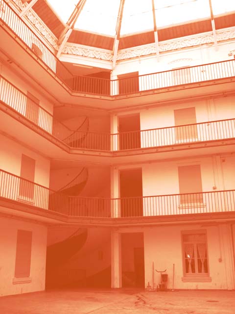
| too red for me, with not enough contrast, but i do like the pattern |
|
|
|
05/05/2008 12:07:44 AM |
|
|
|
05/03/2008 12:54:46 PM |
| A little too orange. I think I'd like it with a little more definition in the shadows and highlights. |
|
|
|
05/03/2008 05:49:01 AM |
| For me this looks too washed-out and I'm sorry but I don't find it very interesting |
|
|
|
05/02/2008 05:46:11 PM |
| It's a little too orange, and needs more contrast. The darkest tones aren't dark enough and that gives is a foggy feeling. |
|
|
|
05/02/2008 02:42:04 AM |
| Perhaps a bit too redish and misty? I like the stair case that runs through very much though. |
|
|
|
04/30/2008 10:19:54 PM |
| Too washed out and too much sepia. |
|
|
|
04/30/2008 05:58:52 PM |
|
|
|
04/30/2008 05:03:50 PM |
| This isnt really sepia... DNMC. Plus you need more contrast. |
|
|
|
04/30/2008 04:00:36 PM |
| Lacks contrast and any real focal point. |
|
|
|
04/30/2008 12:38:50 PM |
| well what can you say it is orange, OOF and blurry, |
|
|
|
04/30/2008 12:03:38 PM |
| Seems too overexposed and orange. |
|
|
|
04/30/2008 09:45:52 AM |
| I don't see this as Sepia, it is really more of an orange. The building has some nice angles, but the shot is lacking detail. |
|
|
|
04/30/2008 04:20:36 AM |
| Much too orange for sepia. Sepia tone refers to the coloring of a black and white photographic print that has been toned with a sepia toner to simulate the faded brownish color of some early photographs. |
|
Home -
Challenges -
Community -
League -
Photos -
Cameras -
Lenses -
Learn -
Help -
Terms of Use -
Privacy -
Top ^
DPChallenge, and website content and design, Copyright © 2001-2025 Challenging Technologies, LLC.
All digital photo copyrights belong to the photographers and may not be used without permission.
Current Server Time: 04/29/2025 01:12:04 PM EDT.