| Author | Thread |
|
|
06/25/2005 12:42:08 PM |
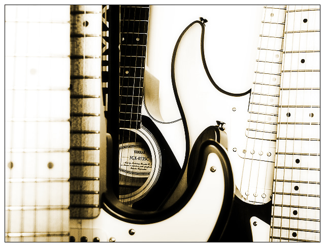
Love the high contrats and the game of lines that the guitars create!
Absolutely a wonderful image! :) |
|
|
|
04/07/2004 07:39:27 PM |
| hmm... acoustic guitar! well I get it now, but still, to me a guitar is a guitar, and that's probably what the majority are thinking... Besides that your composition is extremely good. |
|
 Photographer found comment helpful. Photographer found comment helpful. |
Comments Made During the Challenge  |
|
|
04/06/2004 12:42:09 AM |
|
| Photographer found comment helpful. |
|
|
04/05/2004 04:25:45 PM |
| Beautiful detail and focal point |
|
| Photographer found comment helpful. |
|
|
04/04/2004 01:29:48 AM |
| I think this image could have supported the challenge better if it wasn't so washed out. It is difficult to see the depth of the acoustic in the background |
|
| Photographer found comment helpful. |
|
|
04/03/2004 08:02:04 PM |
| this is a nice shot, as an image... i like the colours, the light, but i don't get the message of it, i don't understand who's hiding and what is out of place.... |
|
|
|
04/03/2004 09:39:21 AM |
| can't tell what's hiding because overexposure hides a lot in this image |
|
|
|
04/02/2004 06:42:48 AM |
| Interesting and well done. I like the sepia tone here. |
|
| Photographer found comment helpful. |
|
|
04/01/2004 05:44:06 AM |
| this didn't strike a chord with me |
|
|
|
04/01/2004 03:47:17 AM |
I like your pic
but I don't know what is out of place here |
|
|
|
04/01/2004 02:33:08 AM |
| seems overexpsoed, too contrasty, ugly to look at |
|
|
|
03/31/2004 10:44:15 PM |
| Great composition - the blurs, lines, and one-color high contrast look all combine extremely well. What keeps this from scoring higher is that nothing in the photo seems out of place... |
|
| Photographer found comment helpful. |
|
|
03/31/2004 02:35:48 PM |
| nice idea , well executed. |
|
| Photographer found comment helpful. |
|
|
03/31/2004 09:54:28 AM |
| this picture is c onfusing and what is out of place. |
|
|
|
03/31/2004 01:11:03 AM |
|
| Photographer found comment helpful. |
Home -
Challenges -
Community -
League -
Photos -
Cameras -
Lenses -
Learn -
Help -
Terms of Use -
Privacy -
Top ^
DPChallenge, and website content and design, Copyright © 2001-2025 Challenging Technologies, LLC.
All digital photo copyrights belong to the photographers and may not be used without permission.
Current Server Time: 03/12/2025 02:42:21 PM EDT.