| Author | Thread |
|
|
05/26/2008 01:08:16 PM |
| I guess I should have left a little more analysis with my in-challenge comment. I did give it a 6. I think the main issues that held it back were probably the tilt and the lighting was ok, but not the best for the subject. I also agree that the slight sepia tone didn't come off well. I would have played off the contrast of the black and silver. |
|
 Photographer found comment helpful. Photographer found comment helpful. |
|
|
05/26/2008 02:13:27 AM |
| I think this is fabulous, it was my first camera & given to me by my mother - I am sure I still may have it, but I doubt if I will ever bother to dig it out. This photo is a wonderful reminder of all those hundreds of terrible drug store processed vacation pictures I made with it. |
|
| Photographer found comment helpful. |
|
|
05/26/2008 01:14:47 AM |
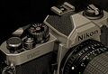
Looking at this image, straight away I notice it is a bit canted to the side and not level with the edge or parallel to the ground. A bit rotation in post or a reposition in capture would fix that easily.
Next, I enjoy the placement of the subject as well as the bottom plank. I believe it adds an extra depth and feel to the image.
I feel the sharpness and focal points of the image are strong on the subjects edges. Though with the flash disk there is a loss because of the smoothness of the disk.
The sepia tones I do not believe work well for this image, or they were not pushed enough, they seem a bit off tone. Though one thing that makes this image difficult to light is because of the large silver area and the blacks. Which create hot highlights within the tones. I am wondering how this would have been straight b/w without the sepia tone.
Overall I felt this was one of the better images because it focused on the subject without a lot of added flash and bang. However, the dish really distracts me.
I wonder, What if you used two lights from the rear, one on each side at a 45 degree, than use a pin-point light for the face plate but not hitting the dish, Than also another pin point light turned way down at a slight front angle, a bit more than your front light to light the dish. This should create strong highlights on the edges of the subject, as well as gain more control over highlights and shadows along the difficult silver and black combinations.
Andrew |
|
| Photographer found comment helpful. |
|
|
05/26/2008 12:49:26 AM |
| Not entirely sure why this scored and placed where it did. No gimmick? Technically perfect. And I never had one of these so it's neat to be able to see all the detail and wonder about the fun and enjoyment it gave someone. I like the B&W versus color option. Nice built-in diffuser, too. :-) |
|
| Photographer found comment helpful. |
Comments Made During the Challenge  |
|
|
05/25/2008 09:42:48 PM |
|
| Photographer found comment helpful. |
|
|
05/25/2008 08:26:04 PM |
| One of the best of the challenge - 7 |
|
| Photographer found comment helpful. |
|
|
05/19/2008 05:06:17 PM |
| I like the vintage feel here, as really like the idea of the camera hanging by it's strap. |
|
| Photographer found comment helpful. |
|
|
05/19/2008 02:25:03 PM |
| i kind of like this picture, alot, great idea, shot, title, etc. |
|
| Photographer found comment helpful. |
|
|
05/19/2008 12:58:30 AM |
| I have one of these. Actually, I think I have two. Someone gave me one as a gift, not knowing I already had it. Too bad you didn't have a flashbulb to put in it. |
|
| Photographer found comment helpful. |
Home -
Challenges -
Community -
League -
Photos -
Cameras -
Lenses -
Learn -
Help -
Terms of Use -
Privacy -
Top ^
DPChallenge, and website content and design, Copyright © 2001-2025 Challenging Technologies, LLC.
All digital photo copyrights belong to the photographers and may not be used without permission.
Current Server Time: 03/12/2025 07:46:34 PM EDT.